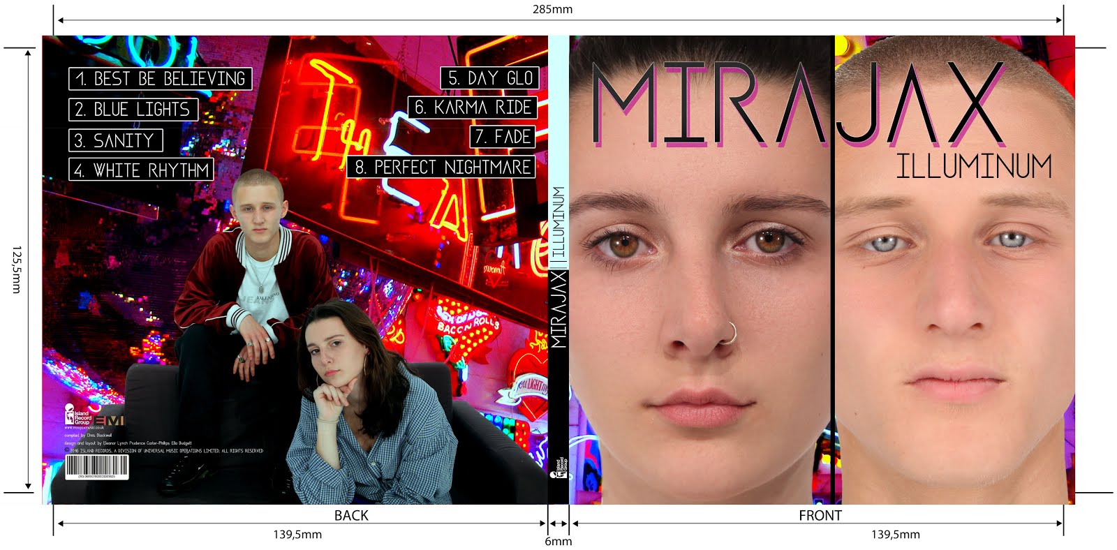
- album title
- artist/band name
- focal image, often of the band/artist or of an identifiable symbol for the band/artist
- barcode
- track list (on back)
- release dat/period
- copyright small print
- Parental Advisory?
- visual motif
- colour theme
- institutional information
- general credits
- booklet/extra content
- website and/or contact info
- promo stickers
The purpose of an album cover is, primarily, to sell the product but also to INFORM and ENTERTAIN. It needs to be visually pleasing and attractive enough that it will stand out to the consumer and make them want to either pick it up or click on it. to find out more.
We will be creating a debut album so it is important we also sell the artist/band as a new product on the market; we need to create an identity for them which is attractive for our particular TA. Our cover needs to have visual links to the musical content in our album-it can't tell a different story to the music.
I gathered together a variety of albums but with the same concept in the back of my mind:colour. I found the following...
 |
| Acid Rap - Chance the Rapper |
 |
| Kanye West - Graduation |
 |
| FKA Twigs - LP1 |
I personally studied Mika's debut album Life In Cartoon Motion.

Here are some pages from our project notebook where we shared some ideas on paper.
In conclusion, on our album cover we definitely want to include:
- A bold album title
- A bold artist name, perhaps bigger font than the album title
- All the typical conventions of a debut cover as explained in this post
- A focal image of our artist/band which creates their identity
- A clear link between the visuals on our cover with the music


No comments:
Post a Comment