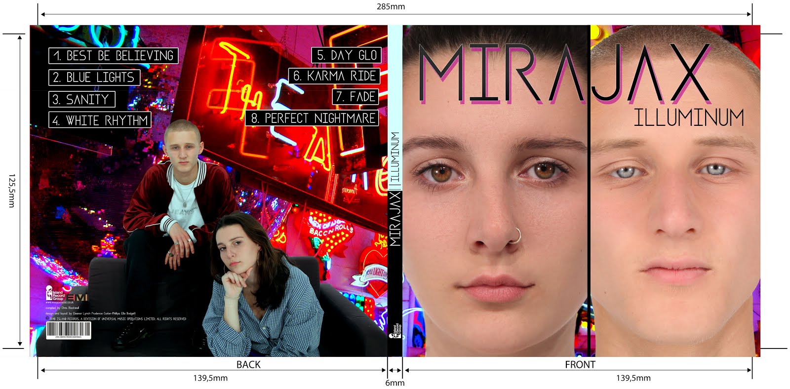
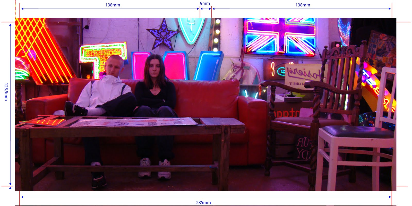
Our Website:
We based our website design on the AlunaGeorge and Rae Sremmurd websites which I have inserted images of below.
 |
| we used their set-up of having just one scrolling page with separate sections on it for each heading |

 |
| we took inspiration from their 'instagram page' for our website images |
We had to keep the website conventions in mind while creating our website as well as taking creative inspiration from other artists' websites.
We needed:
We needed:
- a variety of images and videos
- interactive elements for the audience to navigate around the website
- valid information about touring, album, merchandise, meet-up, competitions etc.
- social media links
We asked Jack and Flora (two friends our age) what they would want to see in a artist's webiste ideally. They came up with:
Wix:
We used the website Wix to create our website which was a straightforward website however we seemed to have a lot of problems with our particular website template; it was very slow in terms of reacting to what you programmed it to do and the formatting set would change each time you logged in to edit the website. This was frustrating but we managed to stay patient and deal with the challenges it presented us with.
We initially chose this as our font however we had to change it because it was not free...
This is our new font which will be repeated accross the website and also in our album.
- top songs and videos
- up-coming gigs or tour dates
- contact details and,
- pictures of the artist
Wix:
We used the website Wix to create our website which was a straightforward website however we seemed to have a lot of problems with our particular website template; it was very slow in terms of reacting to what you programmed it to do and the formatting set would change each time you logged in to edit the website. This was frustrating but we managed to stay patient and deal with the challenges it presented us with.
We initially chose this as our font however we had to change it because it was not free...
This is our new font which will be repeated accross the website and also in our album.
Wix was very straightforward to use; all the possible actions are labelled along the left-hand-side of the page. We took our inspiration for the home page from AlunaGeorge's website homepage which looks like this:
We felt it was important to make the first page related to music so the audience straight away knows this website is promoting a music artist. We also found AlunaGeorge's website very clear and easy to navigate around so we took this on board when creating our own website. We used an image of Jax and an image of Mira on our homepage in order to establish who they are and what the website is about from the get-go. We also added the iTunes feature which links straight to the iTunes website for fans to buy the brand new album.
We also felt it was very important to have a section like this with a playback option for the audience to be able to listen to our album. The song "Best Be Believing" plays automatically when you enter our site.
We labelled our news page as "The Latest" which we took from Justin Bieber's website. This is a hub where fans can keep up-to-date on the latest news on MiraJax, inclusing competitions and headline shows.
Designing Our Merchandise:
During week one of production, we also created our merchandise for our website. We wanted to have purchasing opportunities on our website that didn't limit you to just buying the album/song. For this reason, we created the option to buy merchandise and tour tickets.
We created a simple line of merchandise with only 4 products. This is because our artist id not a commercial/pop duo so we felt the excessive use of cheesey merchandise would not be appropriate for our target audience and the edgy image we were promoting.
We simply photoshopped promo shots onto jumpers and bags. This was the final product:


No comments:
Post a Comment