Creating our Digipak:
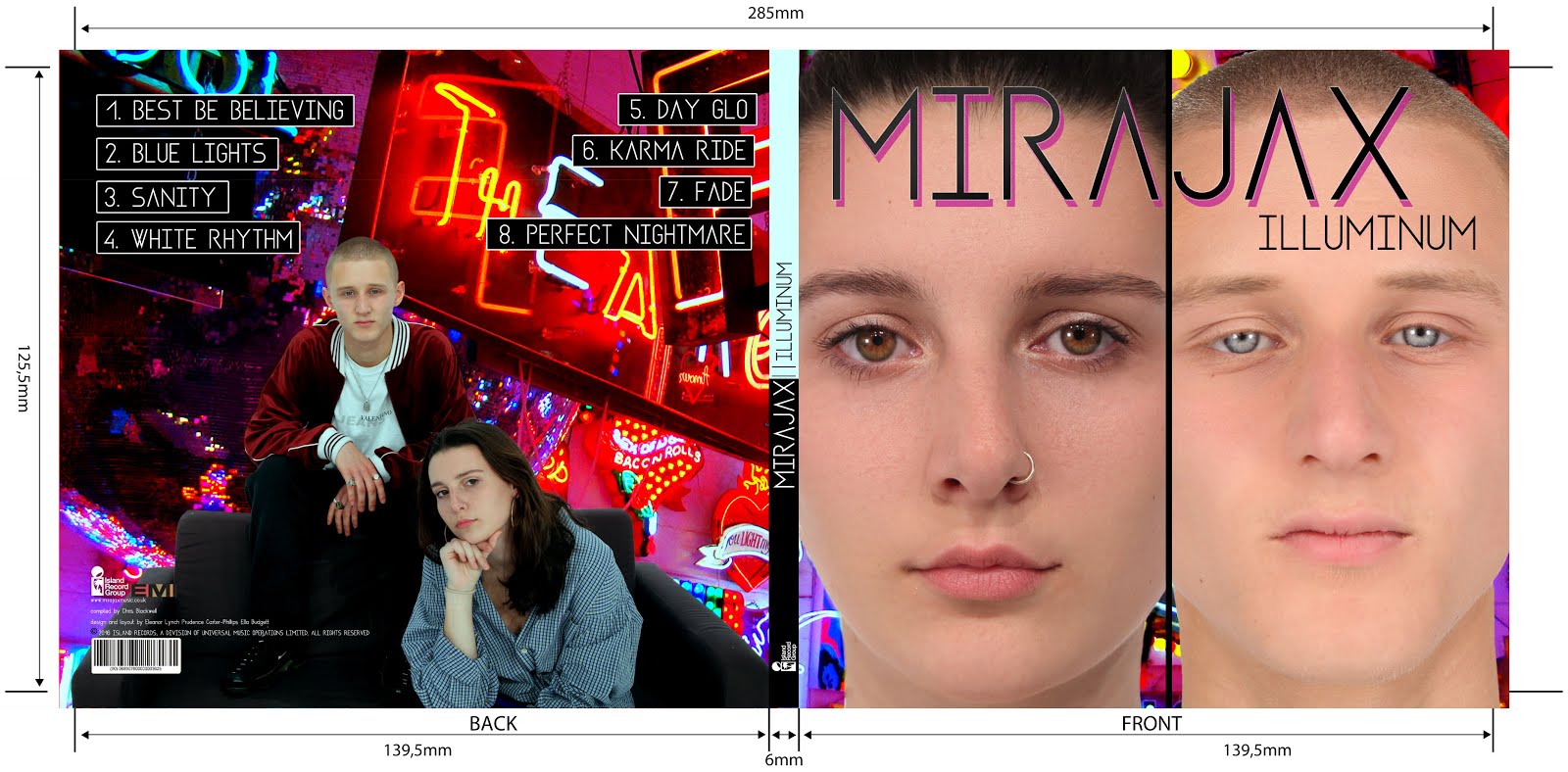
These are the templates we used to base our front and inside sleeves around. On Photoshop they were colour coded like so:
I feel like I learnt a lot of new skills on photoshop as previously it was definitely not my strong point.
Firstly, we followed our planned front album cover but when we had created it, Miss Blackborow told us she thought the front and back panels were too similar and needed some more variety. We all agreed with this and so brainstormed ideas of how we could alter our previously planned album cover. We decided to use one of our studio promo shots for the back panel. It was a choice between one of these two images:
The reason we chose these images is because they had space around the actual image where song names could fit as well as institutional information. We finally decided on the image of both Mira and Jax because as they are an artist duo, we didn't want the sole focus to be on Mira.
 |
| me editing the album using photoshop |
After deleting the background of the image of MiraJax shown above, we then had to choose a background image which would stretch across the front and back panels. We decided on this picture:
In photoshop we used the tools on the right hand side of the screen to edit the image itself.
Firstly we used the colour balance tool:
This allows you to alter the colours in the image, completely changing around the colour wheel of everything in the image.

We then used the levels adjustment tools to change the tonal range of the image and the colours in the image:
Lastly, we altered the saturation levels to make the colours much more intense. As you can see in the finished product...
...the image has been completely transformed which makes the neon lights, especially, stand out.
The front panel was the most tricky to edit. We began with Mira's face covering two thirds of the panel and Jax's face being squashed into the remaining third. However, our teacher Miss Dymioti flagged this up as looking very cramped and un-easy to look at. We agreed and so reflected on our previously planned front panel, changing the 1/3 / 2/3 split screen into a 50/50 split screen.
After editing Jax and Mira's individual close-up shots, we positioned them on the front panel. We used the skin smoother tool to airbrush their skin. We also used the brightness adjustor tool to make their eyes brighter and stand out more.
This is the final result of the front digipak panel:
All our font for titles, song names and artist names are the same, trademark font 'Asgalt Regular'. This font is repeated in our headings in our website also, which increases synergy across our brand.
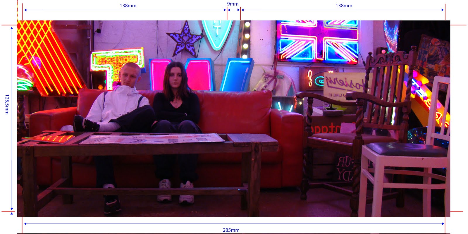
We used this image for our inside panels:
Audience Feedback:
I spoke to a friend outside of school (she is 18) to ask her for her thoughts on our finished digipak.
Would you buy this album? I think if I saw it on a shelf I'd definitely pick it up to have a closer look...it's different to some of the album covers out there; It's cool, I like it a lot.
What age group do you think would buy this album, judging by the look of the album cover? I think, because of the age of the artists and the quirky style of their clothing and wherever the shots were taken, this album would be attractive to older teens and people in their early 20s. I definitely think that both girls and boys would like it too though, because the artists are relatable to both genders.
How professional does it look on a scale of 1 to 10? I'd say around 8.5. I think it looks incredibly professional, however I think by the how the front panel looks, you could maybe guess they're not real music artists just because its not as slick as say, Justin Bieber's album covers. But in saying this, maybe this is purposeful because they're not your everyday music duo.
Overall, we are very happy with the positive feedback we have received and understand that with the tools we had available to us, there was only so much in terms of professionalism that we could achieve with our album cover. However, we definitely wanted to come across as something new and different through our album cover, which we believe to have achieved.
I'm very happy with our final digipak panels. There was only one issue which our teacher notified: Jax's coat was previously blending into the background too much (I changed this).


No comments:
Post a Comment