Introduction
I am in group 1 with Pru Carter-Phillips (8128) and Ella Budgett (8120). To view my portfolio evidence please click on the following three labels, on the right, named; A2 Research and Planning; A2 Construction and A2 Evaluation.
Please view our music video for MiraJax - Best Be Believing
Please view our music video for MiraJax - Best Be Believing
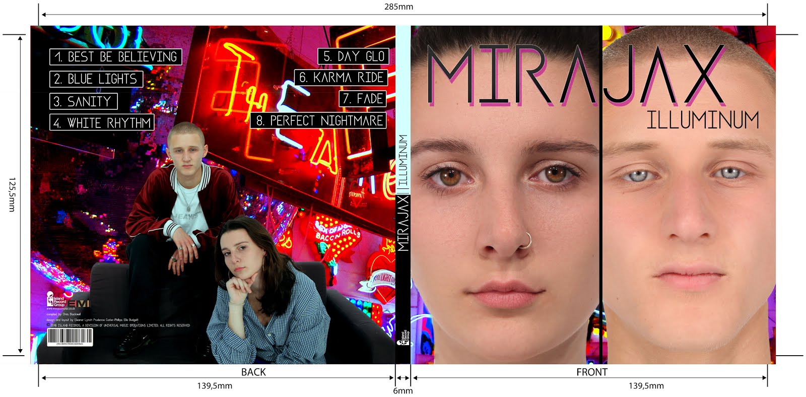
Front and Back Digipak

Above shows the front and back panels of our digipak
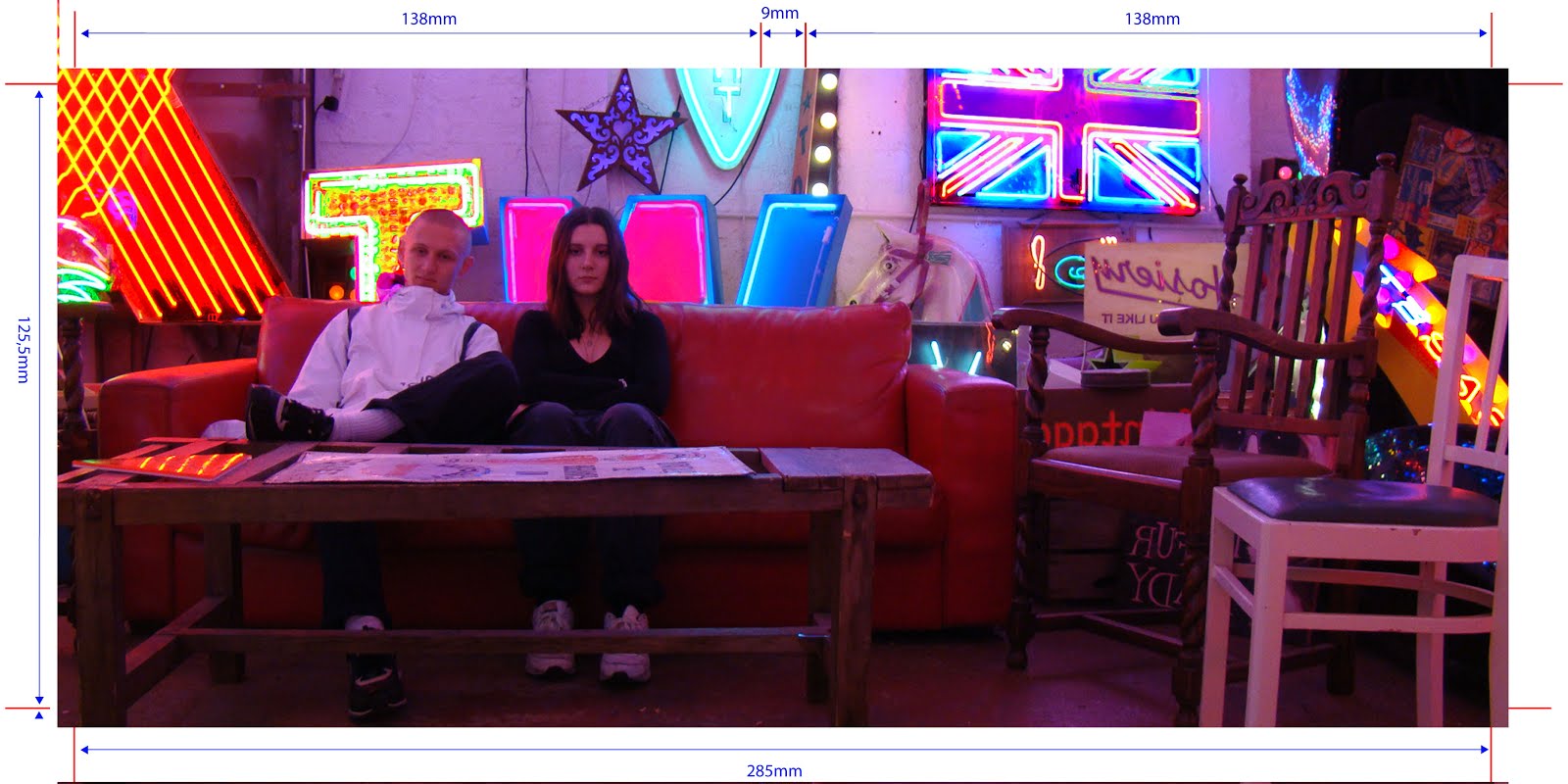
Inside Digipak

Above you can see our inside panels of our digipak
Thursday, 8 October 2015
My Evaluation of AOTT Activity
Our film idea was based around a female who has been kidnapped and locked away for most of her life down a hole, by a disturbed abductor. When she finally manages to escape things aren't how they used to be...the female is on a mission to seek revenge on her kidnapper but things become complicated when she discovers his real identity, the Hang Man.
Our film opening features a number of montage shots giving brief peeks of the setting where the female is trapped. The first shot is of blood dripping down the wall which is followed by a shot of a person being hung with the title of our film to the right-hand side. Shot 3 is of human feet with blood dripping along their toes; The shots go on like this throughout the opening with distinct images which do not tell a story.
Our film opening reveals the title, the main character, the name of the actor who stars as the main character, the two producers and a rough sense of setting.
The titles include disturbing, dark images with an ongoing theme of blood and harm which helps to link the main concept of our film.
We want the audience to have a lot of questions after they've watched our opening. We have purposely left a lot of information out of the opening to make them feel disorientated and unaware of what is to come. However, they should be clear on genre and be spooked out by our first few titles, which should set the scene for the rest of the film. Our opening is ambiguous rather than clear to reflect on the macabre theme.
In our opening sequence we used a variety of shot types with not a lot of connection to each other; this should leave the audience feeling disorientated with the jerky shots to reflect on the horror genre. It also makes it more exciting for the audience because they are seeing action from different perspectives all the time. We inserted our film title in the second shot of our opening sequence because otherwise it would be unclear for the audience on what they were watching. It also helps to set the scene and make them ask questions about how the name links with the rest of our opening sequence and the film to follow. Credits are a legal obligation for the film makers so it is also important that we included these. We gave an establishment of the main character and a rough sense of main setting which I think is vital in an opening sequence, to be able to link with the rest of the film to come.
Although our project sets the scene, gives an establishment of setting and theme, includes the main female character, includes a variety of shots and has the appropriate titles and credits, I think we could have done better. Firstly, I think the title of our film should have been revealed at the end of the opening because it leaves the audience in suspense. I also think our shots could have linked more. For example, shot 5 of a baby head didn't really have much relevance in terms of the rest of our opening sequence and this could be confusing for the audience. The main female character's face could have been shown at the end of our opening sequence as the final image because i think this would create suspense and be scary for the audience, especially if it was shot in a disturbing way. Finally, if we had more time we would have changed the font to look more sleek and professional and also to fit more with the horror genre.
Labels:
AS classwork
Subscribe to:
Post Comments (Atom)


Your opening sequence grid contains many of the classic horror images and you have included some very effective stills. However, I share your feeling that there is some confusion with the story-telling. You reflected on the activity very well, providing a thoughtful overview. Well done.
ReplyDelete