Introduction

I am in group 1 with Pru Carter-Phillips (8128) and Ella Budgett (8120). To view my portfolio evidence please click on the following three labels, on the right, named; A2 Research and Planning; A2 Construction and A2 Evaluation.
Please view our music video for MiraJax - Best Be Believing

Please view our music video for MiraJax - Best Be Believing

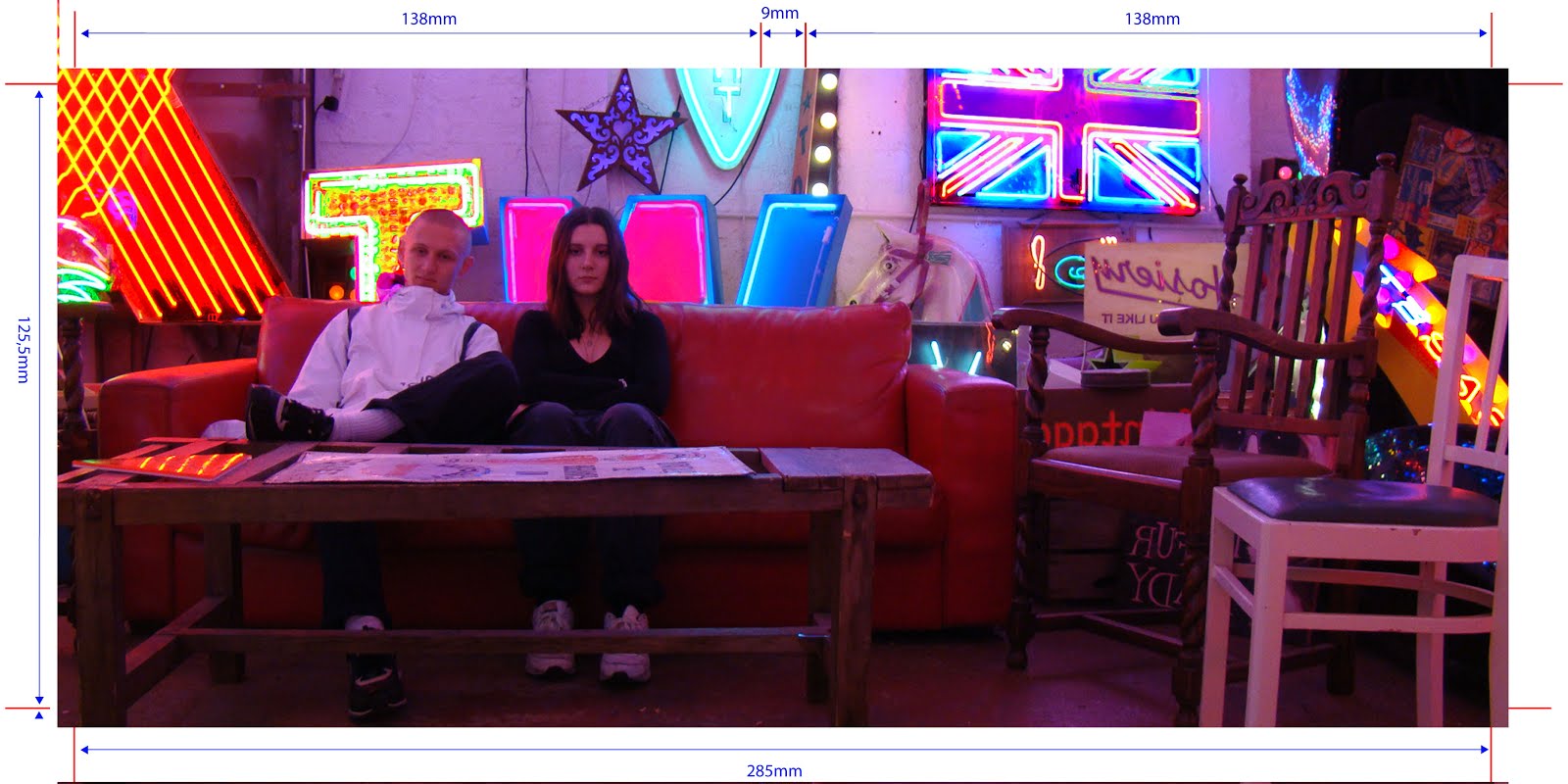
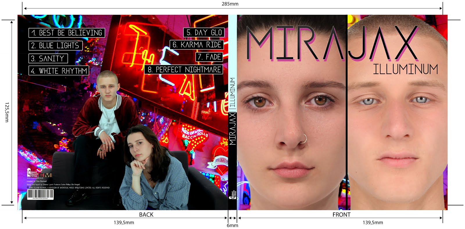
Front and Back Digipak

Front and Back Digipak
Above shows the front and back panels of our digipak

Inside Digipak

Inside Digipak
Above you can see our inside panels of our digipak


Please click this image to enter our site

Wednesday, 4 November 2015

AS Prelim


Our video is called "The Chocolate Mystery". It runs for 1:22 minutes. The story is set in a school and the story line follows Jerom as a student in detention and Mathew as the teacher.

1. Who did you work with and how did you manage the task between you?

 I worked in a group with Jerom Thambioillai and Matthew Davies to produce our video. Between us, we worked out how to equally divide the work load; Matt produced our story board sheets with drawings, Jerom produced our script and I produced our props list and shoot schedule. We started off by agreeing we would set our story in a school seen as that's where our shooting location was and it would be hard to disguise this. We all had our own individual ideas which we pitched to the rest of the group but decided to go with Matt's idea about a student in a detention. From this idea we thought the detention could be to do with a theft and then came the idea of a stolen chocolate bar, as it seemed like a silly reason to be in trouble so would create humour for the audience.In terms of actually filming our clip, I did the majority of the filming as Jerom and Matt were acting but Jerom and Matt both used the camera and directed at least 1 scene each. We were split up into two groups to edit our sequence; I was working by myself and Matt and Jerom edited their version together.
Jerom, Matt and I

2. How did you plan your sequence? What processes did you use? What theories did you try to take into account?

We planned our sequence through several processes; we made lots of storyboard sheets which contained visual and written annotations of all of our shots; we made a script which was a written record of each line of dialogue including stage directions. We also produced a props list for any costume or props we needed in our sequence. We tried to take into account the following theories of genre, narrative, character, setting and continuity. We made sure not to include any random, unlinked shots which would not create successful continuity and when editing I made sure all the shots
The first page of our storyboard (shots 1-4)
were matched on action with clean cuts (or as close I could get). Our genre was a school drama so we had to show this through mise-en-scene which conveniently meant we didn't need to do too much as our filming location was in a school anyway. We made a plan of our setting; it is a very rough birds-eye-view sketch of the classroom with rough guidelines as to where the furniture will lie in our sequence. To accurately represent the characters in our sequence we had to use costume. We included costume in our props list; Jerom was told to wear smart-casual clothes and Matt was made to wear a suit jacket and shirt with smart trousers. In order to stick to our brief we had to avoid breaking certain rules such as the 30 degree rule and make sure we used certain features such as the 180 degree rule, eye-line matches and shot reverse.
Our props list
Our script
Our rough room plan

3. What technology did you use to complete the task, and how did you use it?

The technology we used to film our sequence were as follows:
  • The Canon HFG30 camera which looks like this...

...which we kept on the automatic manual setting in order to keep it simple for the time we were allocated. 
  • We used a Tripod to keep our shots steady and look professional but occasionally took the camera off the tripod, for example in shot 4 (the clock shot), in order to film shots higher than the tripod reached. We also used the Tripod Arm to create smooth pans. 


  • We used a Mic to pick up the background sounds (when wanted) and character's dialogue when they were far away from the receiver.

  • We used Headphones which were plugged into the camera. Whoever was operating the camera for a particular shot would wear these to ensure all wanted sound was being picked up and all unwanted sounds were not interfering. 
  • We used a Clapperboard to make it clear when we are editing, which shot the following clip was of.

The technology we used to edit our shots were as follows:
  • a PC
  • Adobe Premiere Pro - I used this editing software to edit our sequence. It allows you to drag and drop clips, trim them down, cut bits out, adjust sound levels and more. 
    This is me editing


4. What factors did you have to take into account when planning, shooting and editing?

We had to take into account many factors when planning shooting and editing such as continuity, narrative flow, making the story easy to follow, sticking to the brief, how we would manage time constraints, availability of equipment and the limitations that came with the number of people in our group. We had only 3 people in our group so this meant we could only have a maximum of 2 actors in ur sequence as otherwise there would be no-one available to film, so we chose Matt and Jerom as the teacher and student only. We made sure we filmed a master shot for every setting included in our filming to allow for any mistakes we realised after filming such as certain shots not being able to match up, so they were backed up with an available master shot. In order to stick to the brief we made sure we filmed a conversation of at least 2 lines of dialogue between our characters. We also made sure we filmed Jerom walking into the room, walking out of the room and sitting down opposite Matt during their conversation. We originally started off with over 20 shots but we had to cut this down in planning when taking time constraints into consideration. This also meant I had to keep editing simple - no captions or fancy cuts etc. 

5. How successful was your sequence? Please identify what worked well, and with hindsight, what would you improve/do differently?

I was, overall, happy with our sequence. However, I think my fist shot was quite jolty and could have been a more smooth zoom out. I think the shot of the clock in shot 4 was not filmed as good as it could have been as the clock was not centred and the shot looked like it was being filmed from the left-hand side when it should have been from downwards to look as if its Matts perspective. Finally, I think we din't pay enough attention to our framing. We should have made more smooth constant changes from long shots all the way into closeups - I think our framings were a bit random in some parts. Although, I think I edited it well to show match on action and I also mixed up the order of our shots to suit the story better. For example i switched up the fist few shots so the clock shot would come after the close up of Matt, therefore making it very clear to the audience that he is looking at the clock. If we had more time, I think we could have re-filmed our shots with dialogue to put more expression into them and also make the action less slow and boring. 

6. What have you learnt from completing this task? Looking ahead, how will this learning be significant when completing the rest of your foundation coursework, do you think?

I ave learnt a lot from this task. I now know that it takes patience and a relatively long time to film all your individual shots including the several takes needed to get it just right. I have also improved on my camera skills, I think, as now I can film a pan more smoothly. I know that you have to take a step back, when filming, and think about each individual shot within a bigger picture to make sure they all follow the storyline clearly. I also need to, in the future, make sure all my shots are filmed with some lee-way at the beginning and at the end to make sure there will be no problems with continuity. 
In my future foundation coursework, I now know how important it is to make all your required planning prep sheets and make sure you have them on the filming days because our group, unfortunately, did not have our storyboard sheets on the day of filming which meant we had to use a section of our allocated time to remake the storyboard and we could have missed out shots in doing so. 


Friday, 9 October 2015

Continuity Task 2 (BLK)


My chosen sequence is a 1 minute scene from the 1964 James Bond film, Goldfinger. In this sequence James Bond gets introduced to his personalized gadgets from Q. There are several techniques used to create continuity in this scene.
At the very start of the scene we get a wide mid shot of James Bond and Q. This helps to establish the two main characters for this particular scene and we get a sense of setting as if they are in a car park or garage. Then the camera pans slightly to the right as if it will follow Q but then zooms into Bond which shows us he is the main character. This shot also lets the audience see Bond's expression which could connote his feelings towards Q or the situation.
It then cuts to a wide mid shot of Q as he walks beside the car. The camera follows him which keeps the continuity of the scene not letting the audience loose sight of him. After Q asks "You see this arm here" the camera then cuts to a MS of Bond leaning at the arm in the car. This creates continuity because it means the audience are not confused where the arm is in he following shot and it also tells us we are viewing the arm from Bond's perspective, making the shots flow clearly. Q also taps the arm in the next shot, further showing the audience what they are meant to be looking at. This shot is a CU which makes the audience focus just on the arm and closes out any other distractions.
This is followed by a MS of Bond leaning down to look at the next gadget as we hear Q saying "Now this.." but we do not see a shot of Q because this would make the focus be on Q when the director clearly wants us to focus on Bond mainly. The MS of Bond shows us that the next CU shot of the gadget is from Bond's perspective.
We then get a cut to a MS of Q saying "Don't touch it" which then cuts to Bond with his dialogue which then cuts back to Q with his dialogue. These shots are showing a continuous conversation between the two of them and the audience knows exactly who's speaking in each occasion.
The last two shots feature a shot of Q saying " I never joke about my work 007" which is made to be significant as the next shot is a cut to Bond with no words but an embarrassed expression so the audience is left in suspense.

Thursday, 8 October 2015

My Evaluation of AOTT Activity


Our film idea was based around a female who has been kidnapped and locked away for most of her life down a hole, by a disturbed abductor. When she finally manages to escape things aren't how they used to be...the female is on a mission to seek revenge on her kidnapper but things become complicated when she discovers his real identity, the Hang Man.
Our film opening features a number of montage shots giving brief peeks of the setting where the female is trapped. The first shot is of blood dripping down the wall which is followed by a shot of a person being hung with the title of our film to the right-hand side. Shot 3 is of human feet with blood dripping along their toes; The shots go on like this throughout the opening with distinct images which do not tell a story.
Our film opening reveals the title, the main character, the name of the actor who stars as the main character, the two producers and a rough sense of setting.
The titles include disturbing, dark images with an ongoing theme of blood and harm which helps to link the main concept of our film.
We want the audience to have a lot of questions after they've watched our opening. We have purposely left a lot of information out of the opening to make them feel disorientated and unaware of what is to come. However, they should be clear on genre and be spooked out by our first few titles, which should set the scene for the rest of the film. Our opening is ambiguous rather than clear to reflect on the macabre theme.
In our opening sequence we used a variety of shot types with not a lot of connection to each other; this should leave the audience feeling disorientated with the jerky shots to reflect on the horror genre. It also makes it more exciting for the audience because they are seeing action from different perspectives all the time. We inserted our film title in the second shot of our opening sequence because otherwise it would be unclear for the audience on what they were watching. It also helps to set the scene and make them ask questions about how the name links with the rest of our opening sequence and the film to follow. Credits are a legal obligation for the film makers so it is also important that we included these. We gave an establishment of the main character and a rough sense of main setting which I think is vital in an opening sequence, to be able to link with the rest of the film to come.
Although our project sets the scene, gives an establishment of setting and theme, includes the main female character, includes a variety of shots and has the appropriate titles and credits, I think we could have done better. Firstly, I think the title of our film should have been revealed at the end of the opening because it leaves the audience in suspense. I also think our shots could have linked more. For example, shot 5 of a baby head didn't really have much relevance in terms of the rest of our opening sequence and this could be confusing for the audience. The main female character's face could have been shown at the end of our opening sequence as the final image because i think this would create suspense and be scary for the audience, especially if it was shot in a disturbing way. Finally, if we had more time we would have changed the font to look more sleek and professional and also to fit more with the horror genre.


TV Drama Textual Analysis


Empire: Series 2 Episode 4


(Clip: 9:30-13:50)
At the beginning of this clip Lucious Lyon, who is presented to be the dominant, strong and brave anti-hero male character in Empire, is caught in an emotional scene where he is reminiscing over a dead friend. The music played in the background is of slow-paced violins which keep the mood nostalgic and sad; this scene shows an emotional side of him which is often stereotyped as a feminine characteristic and considered weak. This sets up the mood perfectly for the next shot of Cookie Lyon walking into his office to join him. Cookie immediately makes an insult towards Lucious highlighting his weakness-"Don't tell me you gettin' sentimental on me". This makes her seem the dominant character out of the two of them because she feels comfortable enough to criticize him and because of the fact that she barges straight into his office with no warning in an intimate scene for Lucious. Also, the choice of clothing - sunglasses and a smart two-piece suit – makes her character powerful and intimidating. The next shot is a wide establishing shot portraying the wealth their family holds by showing their luxurious setting. Although Cookie then follows with some snappy demands for Lucious, when she has finished speaking she sits down on the sofa and takes her glasses off leaving Lucious at a higher level to her. This succeeds to contradict her power of Lucious and he regains dominance. This connotes the two's competitive, constant battle for power over the other. However, after Lucious says "What's in it for Lucious Lyon?" he then goes to take a seat opposite Cookie on the sofa as they begin to negotiate connoting their equality after-all. In this scene they talk in calm tones with no dominant speaker. When Cookie gets up to leave we see the ex-couple bicker and Lucious calls his ex-girlfriend a "bitch" which highlights his alpha-male character and follows with the historical stereotype that men are worth more than women. However this is broken when Cookie then throws insults back at him and finally turns her back on him and walks away with a final remark showing that she won the quarrel.

The following scene features Lucious' homosexual son, Jamal, taking part in a photoshoot in his and his partner's apartment. Jamal's photographer asks him to play a song on his piano so he does and sings along too. Jamal challenges the typical camp stereotype that is usually used to portray homosexual characters in TV. Jamal is made to look attractive and masculine in the robe he is wearing which reveals his muscular physique and his voice sounds low and manly; not the usual high-pitched, soft stereotyped tone. However, when Jamal beings to sing, his voice changes to be quite feminine and high-pitched. This could connote his more feminine or sensitive traits that he expresses through his lyrics and singing voice. 

Thursday, 1 October 2015

Film Opening Analysis and AOTT research (DYM)

 
  1. My chosen film opening sequence has been taken from "Side Effects", a crime-drama thriller.
  2. The story takes place in New York which is not obvious from the title sequence, however from watching the full movie I know this is its setting. I think the whole film is spread over 4-8 months as Emily, the main female character, has to go through several clinical trials which usually carry over 2-3 months at a time. 
  3. This title sequence consists of a series of shots, mainly pans and zooms, of different medical equipment and medication. Most of the shots are in black and white. On the shots, there is text overlaying the images with production information such as main characters and producers. The order in which the shots are placed is not significant to the story telling because the title sequence does not begin to tell the story; it only sets the atmosphere and the rest is up to the audience to decide. 
  4. The events in Side Effects' title sequence are unconnected and therefore distinct. No specific events occur in the sequence because it only contains a series of shots which are unrelated...apart from the fact they are medicinally themed. 
  5. No characters are physically introduced in this opening sequence. However, the names of some of the main actors are introduced on-screen in the form of credits. For example, Jude Law.
  6. As I said previously, most of the shots are in black and white; I think this helps to address the obvious medical theme because it feels plain, monotone and depressing, just like a hospital. The second shot features a birds-eye-view CU of a lid for some pills. On the lid is written "health advice?". This could be an indication of the therapy sessions to come in the film and the relationships between patients and doctors in Side Effects. The repeated shots of different types of pills further questions the audience why medication is so significant to the story telling, as it appears in both the title and opening sequence. I think a lot of the story is withheld in this title sequence but even in doing this they could be hinting more about the film; We are left confused and still wanting answers by the end which is similar to the film as it follows a very unexpected twist at the end which the therapist has to figure out. Any obvious information is withheld to keep suspense with the audience so they stay interested in what's to come. Although, the pills spilling at the end of the sequence juxtaposing with the pills ordered in the previous shot could be a big clue to the story ahead. Perhaps this is done to symbolise destruction; so maybe a drug related mishap. 
  7. I think the audience needs to see the appearance of the main characters at the start of the film to be able to fully engage in the plot. There also could be an establishment of setting. For example, a character walking down a busy New York street. I think the audience needs to know a bit about the lives of the main characters so they can get some understanding of how things are going to change or stay the same. However, in saying this, I'm sure information is purposely withheld in this opening and could contribute to the way the story is told effectively because of this. 
AOTT Research

Zombieland(2009)

The Forbidden Room(2015)


The Zombieland and The Forbidden Room film opening sequences contrast aesthetically to create the atmosphere for two opposite genres. Zombieland is filmed in vibrant colour and is high-key lit with all but one of the shots set in the daytime; this makes it clear to the audience it is a light-hearted film, perhaps a comedy (despite the goriness!). Whereas The Forbidden Room is made up of a series of early title designed shots which seem to shudder and glitch making the audience feel as if they are in an old-fashioned movie theatre watching something from a tape rolling. The movement of each title image also creates an eery atmosphere reflecting on the horror genre of the film. Zombieland has a clear establishment of setting. From the shot 10 seconds in of the American flag, we know it's set in the United States which is later confirmed with the voice over's American accent. Both sequences include background music which helps to set the atmosphere needed in each film. However, only Zombieland uses a voice-over on top of this which keeps the mood informal and engaging unlike The Forbidden Room's opening sequence which only uses music for effect keeping the atmosphere scary and the audience on edge. Only Zombieland include some CGI shots. For example, the shot of a burning planet. Guy Madden decided against using too contemporary film making techniques in The Forbidden Room because he wanted to mimic film structure of much earlier times.  Also, Zombieland features many different settings which would have had to of been individually set up for each shot, and advanced make-up on actors which would have needed make-up artists and taken extra time. Overall, the feeling the audience receives after watching each opening sequence is very different; Zombieland leaves you ready to watch a comedy and intrigued to find out who's speaking on the voiceover and why he knows so much about how to handle a Zombie apocalypse! Whereas The Forbidden Room leaves you sitting at the edge of your chair waiting to jump at he twisted, creepy scenes to come..also leaving you intrigued about why the room (whatever this room is) is forbidden. 

Sunday, 27 September 2015

Continuity Task (BLK)


The story we were meant to portray in our accident video was a murder scene which had taken place in a lift. Flo, the first shown female actor, walks into a lift with the second female actor, me, already standing inside. As we see the lift go down on the digital display, the doors open to reveal, now dead, me  killed by Flo. We attempted to show full continuity by using a pan shot in the last shot which carried the viewer smoothly across the action. However we did not achieve a good narrative flow or full continuity. For example, in shot 1 Flo walks into the lift, which is not matched on action in shot 2 as she is then outside the lift again walking in. This needs to be edited to ensure the movement of Flo follows through into the second shot. From shot 2 to shot 3 the camera went from a wide shot to a close-up; this change in shots is too extreme and shows no special awareness or narrative flow. Also, in shot 3 it is not clear to the audience whose perspective the shot is from, making the storyline more confusing. Shot 3 doesn’t show where this digital display is and it is not clear it is even part of the lift. We could have altered this shot by using a zoom from a wide shot of the lift to a close-up of the digital display above it which would show the audience where exactly it was. I think we need to really think about the order in which we choose to shoot particular types of shots. There should be a gradual change from wide shot to extreme close-up shown through a number of shots to keep full continuity.

Friday, 18 September 2015

My Film Still Analysis (BLK)

My chosen shot

My group's chosen genre was horror. We wanted to create a sinister feel, which we achieved by creating a zoomed-in, low-key lighted shot of Flo. Flo's hair was placed in front of her eyes, masking part of her face to make the viewer ask questions about what she's hiding and why which should give them a sense of anxiety and anticipation for when these questions are answered. We used a yellow filter on the lights so the colour scheme was pale yellow and black, which fitted with the primitive, macabre atmosphere. When we captured the shot, Flo's hands, fortunately, were moving which made a blur across the image to look as if she was shaking the banisters; Perhaps she is trying to get out. This tied in perfectly to make her seem separated from civilisation. The shot was a medium close-up making the scene feel more intense and enclosed for the viewer and suggesting Flo is either trapped or caged up as a punishment.
If we had a chance to compose this shot again, I would've made the lighting darker to make the shot even more intense and creepy. I also would move the camera slightly to the right to close the shot in more on Flo and take away the space on the left side of the image.