OUR TARGET AUDIENCE:
Primary audience:
- Fans of the Electropop genre
- Young adults/teens aged 16-24
- Boys and girls
Secondary audience:
- Older fans of the genre (25+)
- People who are interested/keen on the UK music scene
- Fans of similar genres e.g Pop
Tertiary audience:
- Friends/boyfriends/girlfriends/parents of fans of the genre who might come across MiraJax subsequently
- Music fans
USES AND GRATIFICATIONS:
In order to appeal to our target audience, we had to keep the uses and gratifications theory in mind at all times.
Our typical audience member would stream music through services such as Soundcloud and Spotify, however they would be likely to buy an album through iTunes of an artist they particularly liked.
Below, I have created a Prezi presentation demonstrating how we used the uses and gratifications theory throughout our project.
FEEDBACK DURING THE CONSTRUCTION PROCESS:
We got audience feedback every step of the way during the construction of our music video, website and digipak. This way we could constantly improve certain aspects and realise what was going well and what was not going well.
Our music video:
We started off by getting feedback from our rough cut. The rough cut was vital for us, our audience and our teachers to get a general feel for the music video we were envisioning so they could all give constructive feedback on the good and bad things in our music video.
This is our rough cut:
We asked her quite simple questions (what did you like/what didn't you like) as we knew our rough cut was not a true reflection of what we wanted to create; in terms of technicalities, performance and effect, it was very basic.
I also asked Georgia, a 18 year-old female who listens to Electropop sometimes what she thought we could improve on the video in a technical way as she has experience with working with cameras/photography. She said:
"the argument scene needs to be a lot more to the point, it's too boring at the moment"
There is clearly a trend in our feedback for the rough cut - shots need to be more snappy and "to the point" as well as improvement needs to be made in the argument scene.
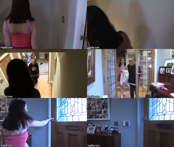
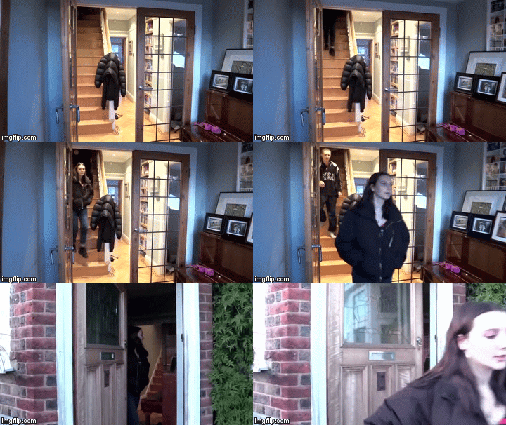
As a result of this feedback we, firstly, completely changed our argument scene. We aimed to make it simpler and quicker so the audience did not get bored but also fully understood what was going on as this was the basis for the entire video.
<---BEFORE
AFTER-->
We took one long shot for our new and improved argument scene as oppose of trying to take several different angled shots which were hard to make continuous as we did previously. This would make it easier for the audience to follow.
As well as this we ended this argument scene on a second shot where the door slammed. This allowed a punchy flow into the next scene and marked the end of the argument; short but sweet.
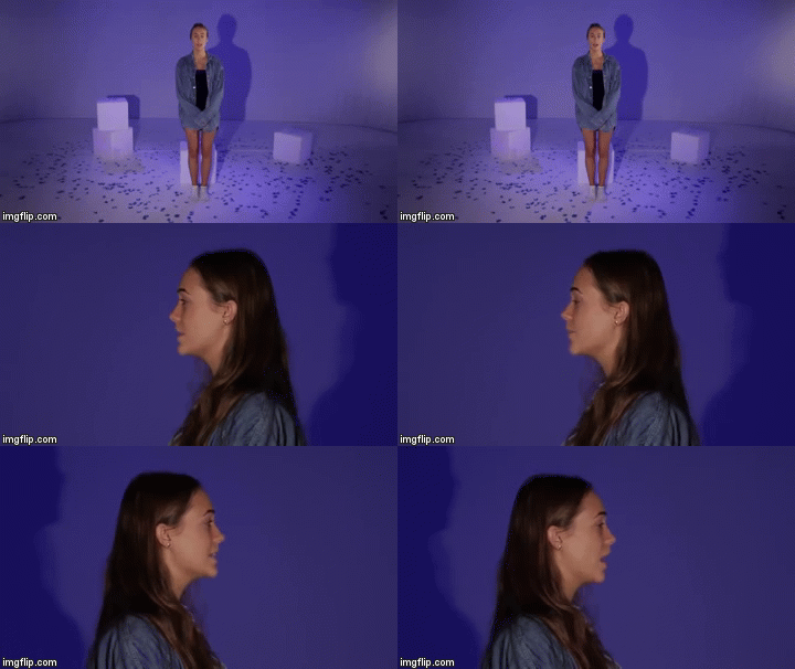
We then altered the way we were previously filming by creating much more movement of the camera and movement and performance in the actual shots. Instead of having Mira standing static, singing to the camera, we made her act much more emotive, over-exaggerated and energetic. As well as this, we added dolly shots instead of just using wide-shots and close-ups.
We then altered the way we were previously filming by creating much more movement of the camera and movement and performance in the actual shots. Instead of having Mira standing static, singing to the camera, we made her act much more emotive, over-exaggerated and energetic. As well as this, we added dolly shots instead of just using wide-shots and close-ups.
<--BEFORE

AFTER-->
Our website:
I got together a small focus group which was made up of a 17-year-old female who loves Electropop - Emma - and an 18-year-old male who loves UK music - Myles. I got them to go through our rough website stating what they liked and disliked along with any reoccurring themes they noticed which brought the website together, if any.
Here are some quotes of what they came up with:
EMMA - "OMG it looks so professional! I can see there are buttons everywhere for me to navigate through the website so thats a pro."
MYLES - "It's very colourful, I'm guessing that's a theme you were trying to present?"
EMMA - "You should have more ways for the audience to get involved with the artist cause at the moment it just a one-way thing"
MYLES - "Yeah, I agree. It's looking really good though, I'd definitely spend time scrolling through because of all the pictures and videos for me to watch"
They both agreed we needed more activities for the audience to take part in, involving them personally. We had thought of this but hadn't quite pinned down how we were going to achieve this. We had another brainstorm and came up with the idea of creating a competition for our audience. This draws on the 'personal relationships' uses and gratifications theory for the uses of our audience so it was vital we took them up on this feedback.
 |
| our constructed competition can be found on our news page |
From our teacher feedback, they told us that the images in our image gallery were too small to view. We changed this and made them expandable when one clicks on the desired image.
Before you could expand them they looked like this:
Before you could expand them they looked like this:
After we altered it, they now look like this:
 |
| the viewer can also exit this expanded viewing by pressing the "X" button in the top right corner |
I created the flat plan which we gave to our audience in order to get feedback on what they thought of it. It was important we did this while still in the construction process so we allowed ourselves time to make changes and didn't waste any time making a real cover on photoshopped that was just going to be re-done.
Firstly, we asked Josh, a 17 year old male who is a fan of UK music, his initial reactions to our flat plan, good and bad.
He said:
"I like the use of the split screen but I think the front and back covers are a bit repetitive and the white background is boring for the whole album cover"
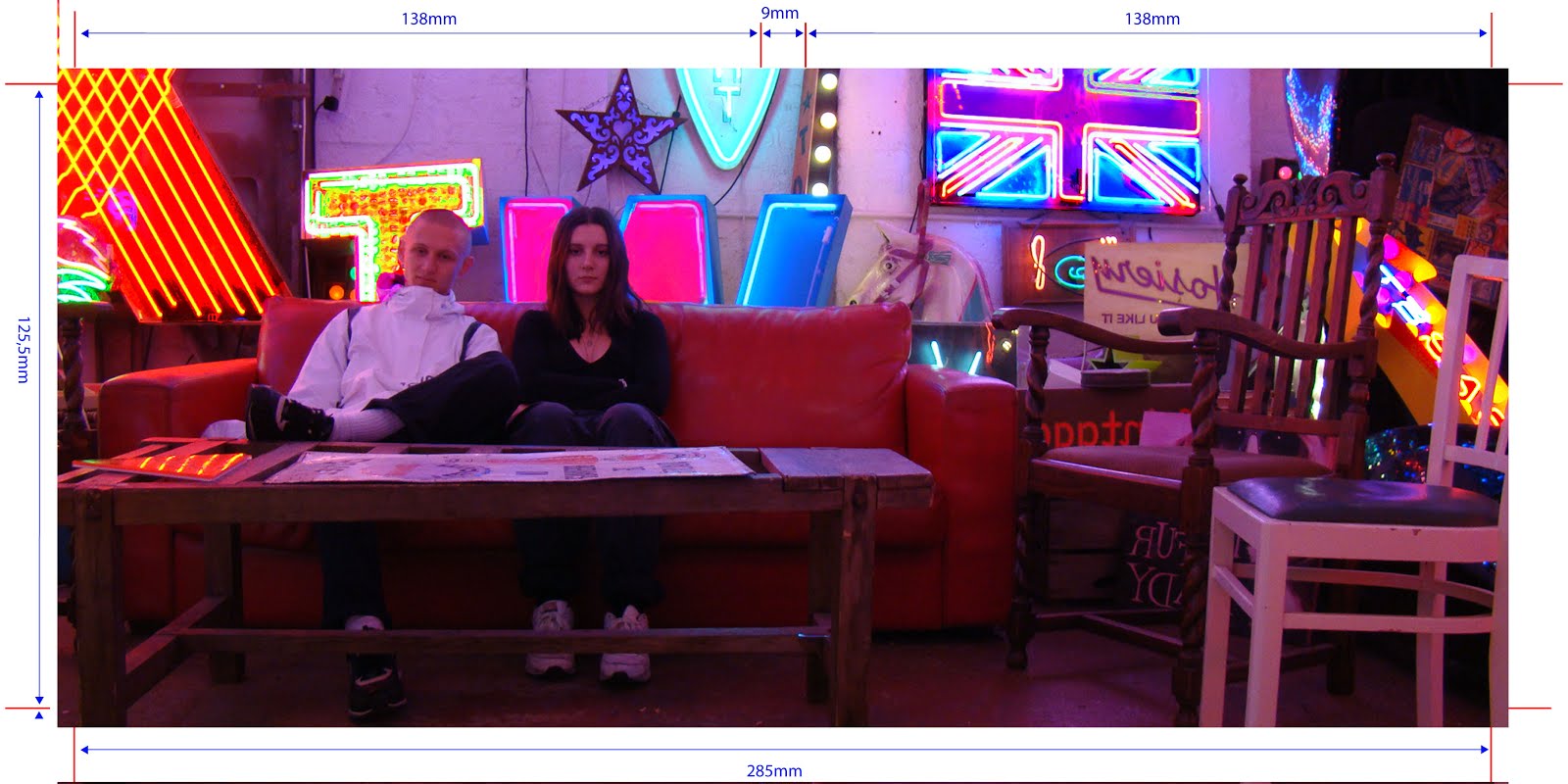
We already knew we would not be using the white background as a background as we would be using an image from our location shoot, which we made Josh aware of. We used this image on the front and back panels of our digipak, which I manipulated using photoshop.
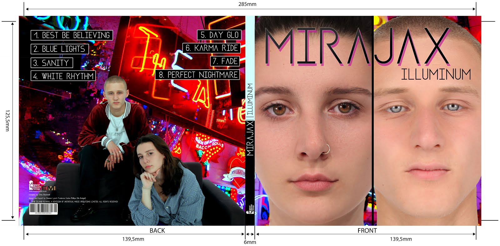
As you can see from our final digipak (above), we also took Josh's advice and changed the back panel to be different from the front. This offered more variation and made it more interesting for the consumer.
FINAL FEEDBACK AFTER WE HAD COMPLETED ALL 3 OF OUR PRODUCTS:
 |
| our flat plan front and back panels |
He said:
"I like the use of the split screen but I think the front and back covers are a bit repetitive and the white background is boring for the whole album cover"
We already knew we would not be using the white background as a background as we would be using an image from our location shoot, which we made Josh aware of. We used this image on the front and back panels of our digipak, which I manipulated using photoshop.
 |
| the original photo |
 |
| after manipulation as our background |
FINAL FEEDBACK AFTER WE HAD COMPLETED ALL 3 OF OUR PRODUCTS:
Digipak final feedback:
When we had finished creating the final digipak. We got feedback from an 18-year-old female fan of Pop music. Here's what she had to say:
From receiving this feedback, we know our audiences needs have been gratified in terms of the synergised imagery and understanding of the presentation of MiraJax's relationship as an artist duo and couple. Georgina also picked up on all the information available to the consumer which was very vast. Overall we are extremely happy with this feedback.
Website final feedback:
After finishing editing our website, we showed the final product to Max, a 17-year-old male who is a fan of electropop music. This is what he had to say:
We are happy with the feedback he gave us overall, which is good because at that point we were unable to change anything.
Music video final feedback:
We used Survey Monkey to construct a survey for audience members to fill out after we had finished creating our music video as this was the main product in our marketing campaign which had been given the most research, planning and construction time to. This way we can spot trends in the feedback we receive by asking of a bigger focus group. We wanted to see if the audience understood what was being presented to them and interpreted the texts in the way we had intended by calculating their uses and gratifications as an audience.
This is the link to our survey:
https://www.surveymonkey.co.uk/r/NMSM5GT
We asked the audience the following questions:
- What is your age? MULTIPLE CHOICE
- What is your gender? MULTIPLE CHOICE
- What music genre(s) do you typically listen to? MULTIPLE CHOICE
- Having watched the music video, which genre do you think the song falls under?
- Having watched the music video, would you like to know more about MiraJax?
- Having watched the music video, is there anything you would change?
- What message do you think the music video is trying to portray?
- What would you rate the music video out of 10? MULTIPLE CHOICE
- How well do you think the music video works with the track? MULTIPLE CHOICE
- Did the music video make you want to buy the album? MULTIPLE CHOICE
100% of the 18 people that completed our survey were aged 16-24. This is perfect because the feedback will be specifically focused on the point of view of our primary audience members.
We had an almost 50:50 outcome with the genders of our audience members. But the results were skewed toward females. This is also very beneficial to us because the feedback they give will be both from a male and female perspective, the 2 genders of our primary audience group.
 |
| 8 males and 10 females responded |
 |
| some of our responses |
'Having watched the video is there anything you would change?' got a wide range of responses, as expected due to the open-ended nature of the question. We were most excited for this feedback as a result.
50% of the people that responded to this question stated they would not change a thing. However 50% stated they would and here are some examples of what people said:
 |
| a well-lit tube station shot example |
 |
| an Alexandra park shot example (bad quality) |
- young love
- the struggle of relationships
Unfortunately only one person caught on to the true meaning on the video - breaking free from all restrictions - but almost every survey member got the theme of relationships which was a sub-meaning to our video. I think this is because we chose to interpret the lyrics in a certain way - through the ups and downs of a relationship - so naturally, if one did not read into the lyrics, this is how they would interpret it in its base sense. We did, however, successfully present the dynamic between Mira and Jack and how the video follows an argument being solved so I am very happy with this. I know this because 100% of people voted "well" or "very well" as a response to the question: "How well do you think the music video works with the track?".
Overall...
The most popular score for our music video was 10 which is the ideal answer of course. I am pleased with our final audience feedback because we did manage to appeal to the majority of our audience.
Overall...
The most popular score for our music video was 10 which is the ideal answer of course. I am pleased with our final audience feedback because we did manage to appeal to the majority of our audience.


No comments:
Post a Comment