Eleanor Jordan-Lynch's Media Blog
Introduction
I am in group 1 with Pru Carter-Phillips (8128) and Ella Budgett (8120). To view my portfolio evidence please click on the following three labels, on the right, named; A2 Research and Planning; A2 Construction and A2 Evaluation.
Please view our music video for MiraJax - Best Be Believing
Please view our music video for MiraJax - Best Be Believing
Front and Back Digipak
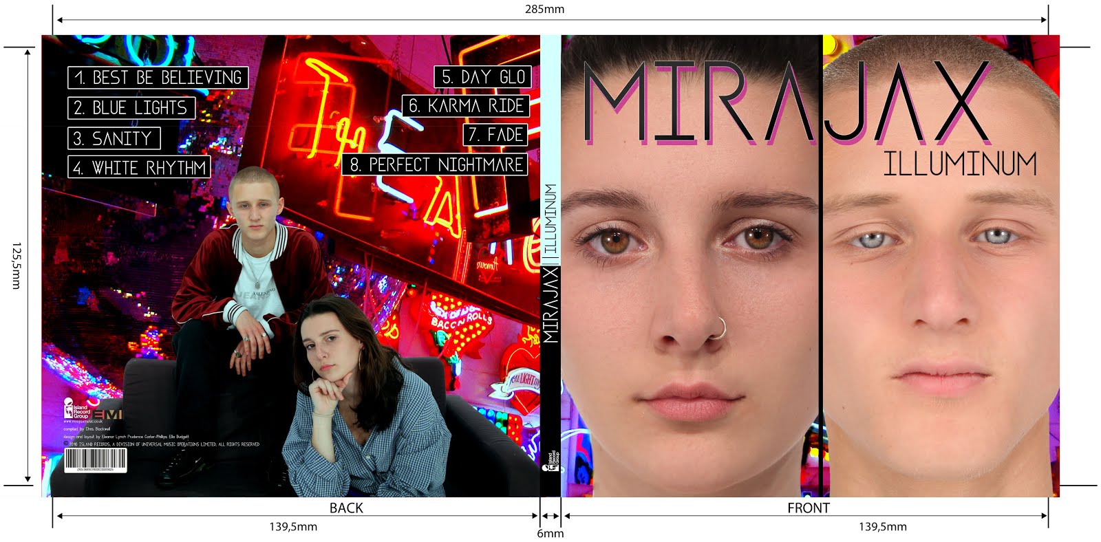
Above shows the front and back panels of our digipak
Inside Digipak
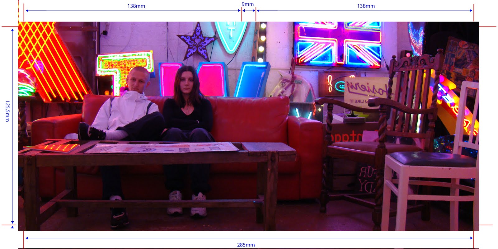
Above you can see our inside panels of our digipak
Saturday, 28 January 2017
Friday, 27 January 2017
Evaluation Question 1: In what ways does your media product use , develop or challenge forms and conventions of real media products?
Our media product, as a whole, manages to follow, develop and challenge forms and conventions of real media products. For example, we took a lot of inspiration from electropop/synthpop websites and combined all the conventions creating a website which conforms to the genre's conventions. In our music video, we followed the forms and conventions of London-based videos aimed at youths but developed this by adding our split-screen visual motif. We challenged the typical form of an electropop album by making our much more visually busy and less simplistic, but still kept to the abstract presentation.
By doing this, we were able to gratify our TA's needs whilst also surprising and enticing them with features they were not necessarily expecting.
OUR MUSIC VIDEO
The purpose of a music video is to promote a new track released by an artist.
Goodwin analysis:
Forms of the genre:
From my research, I found that music videos from the Electropop genre tend to be either performance driven OR narrative driven. However, I do think that the majority of music videos are performance driven.
When the video is performance driven, I noticed that the performance will often be contemporary, sometimes featuring dance or bold colour themes. Lip-syncing is extremely common and some shots will focus solely on the singing. It is common in studio shots to show artists playing electronic instruments such as an electronic drum kit.
When the video is narrative driven, the story is often simplistic but told in a distinguished/abnormal way focusing on artistic or interesting features rather than being a complex storyline that is told in a straight-forward, normal way.
Performance-heavy examples:
Marina and the Diamonds' music video for Oh No! is filmed in a studio. There is, therefore, no strict 'story-line'. The video contains Marina lip-syncing to the camera, always keeping eye contact with the camera lens. The strong colour scheme and 1960s pop art theme is the main focus point for the video.
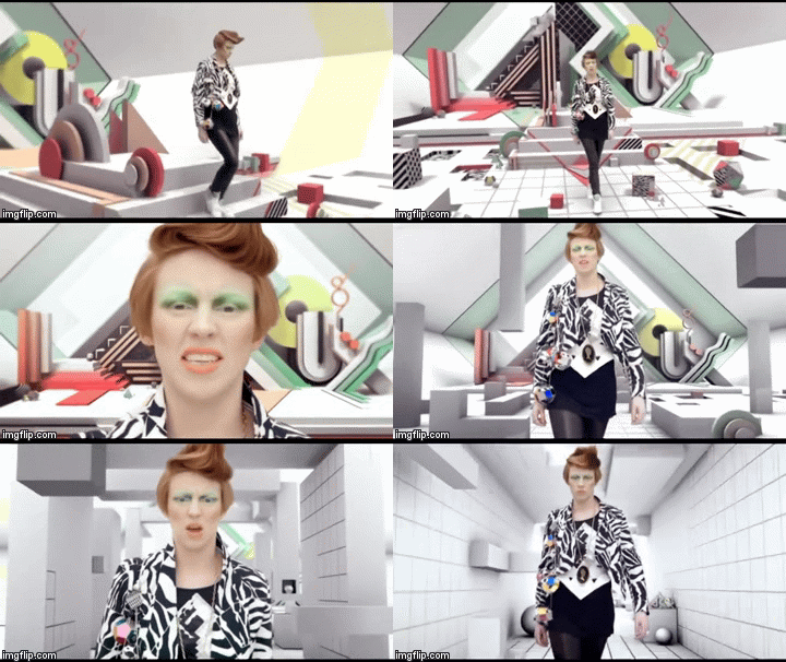
Another example I found was in La Roux's Bulletproof. The whole video is shot in a studio altered in post-production to make it look like the singer is walking through colourful suspended shapes, almost like a video game. This also gives a very contemporary feel as well as being not quite in the 'ordinary'. The main focus f the video is, again, her singing.
Hands by The Ting Tings is filmed in a studio setting where, again, the theme of shapes is used to give a modern feel to the video.We can see the incorporated shots of the artists playing various instruments. She is lip-syncing.
Narrative based examples:
How Deep Is Your Love by Calvin Harris: The video does not feature the artist in the video; we see Gigi Hadid make a journey through various settings including a party scene and a villa/pool scene. The narrative is very simple in the sense that it is a woman enjoying life, partying etc. However it is told in an subjective way; Gigi is presented as a robot-type-person who has either escaped from her creators and is now seeing what the world has to offer or is only dreaming she is doing this.
Another example is Ke$ha - Tik Tok which follows the basic story-line of a teenager going wild, partying and doing everything her parents told her not to do, basically. Again, the colour scheme is very vibrant and fun. The storyline is simple and focuses on partying and young romance which would be relatable to the youthful TA.
The last example is AlunaGeorge - Attracting Flies. This is all narrative. However we still have lip-syncing, just like in the Tik Tok video. The video is based on twisted fairy tales; fairy tales with a modern twist which make them more relatable for youths of today's day and age. The stories are obviously simplistic as everyone is familiar with them but the viewers is kept wanting to see more, wondering how the next fairytale will be altered.
How we applied this to our music video:

Visual motifs:
In music videos of the electropop genre that I have researched, the majority have a distinctive visual motif which is relevant to the branding of their artist. this is a must for the record label to make the product distinguished from other products, especially for a more niche genre like electropop. Marina and the diamonds used a 1960s pop art theme for their video where they inserted comic book writing and expressions in post-production.

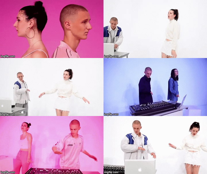
We created a split screen visual motif which we carried through to both our website and our album cover as well as the music video. The split screen symbolised their different mindsets and disjointed journeys where neither of them are able to find each other until, at the end, they come together and the screen is united as one (parallels with how they make-up and their relationship is fixed).

the split screen ^
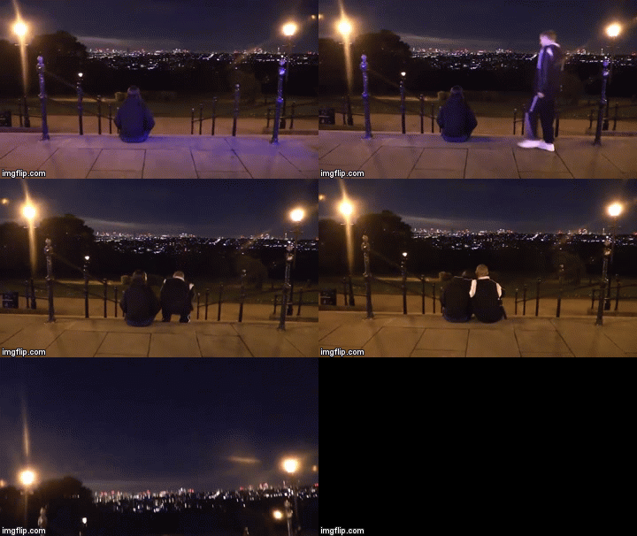
^the ending

How we applied this to our video:
Camera movement:
By doing this, we were able to gratify our TA's needs whilst also surprising and enticing them with features they were not necessarily expecting.
OUR MUSIC VIDEO
The purpose of a music video is to promote a new track released by an artist.
Goodwin analysis:
Forms of the genre:
Narrative or performance driven?
When the video is performance driven, I noticed that the performance will often be contemporary, sometimes featuring dance or bold colour themes. Lip-syncing is extremely common and some shots will focus solely on the singing. It is common in studio shots to show artists playing electronic instruments such as an electronic drum kit.
When the video is narrative driven, the story is often simplistic but told in a distinguished/abnormal way focusing on artistic or interesting features rather than being a complex storyline that is told in a straight-forward, normal way.
Performance-heavy examples:
Marina and the Diamonds' music video for Oh No! is filmed in a studio. There is, therefore, no strict 'story-line'. The video contains Marina lip-syncing to the camera, always keeping eye contact with the camera lens. The strong colour scheme and 1960s pop art theme is the main focus point for the video.
Another example I found was in La Roux's Bulletproof. The whole video is shot in a studio altered in post-production to make it look like the singer is walking through colourful suspended shapes, almost like a video game. This also gives a very contemporary feel as well as being not quite in the 'ordinary'. The main focus f the video is, again, her singing.
Hands by The Ting Tings is filmed in a studio setting where, again, the theme of shapes is used to give a modern feel to the video.We can see the incorporated shots of the artists playing various instruments. She is lip-syncing.
Narrative based examples:
How Deep Is Your Love by Calvin Harris: The video does not feature the artist in the video; we see Gigi Hadid make a journey through various settings including a party scene and a villa/pool scene. The narrative is very simple in the sense that it is a woman enjoying life, partying etc. However it is told in an subjective way; Gigi is presented as a robot-type-person who has either escaped from her creators and is now seeing what the world has to offer or is only dreaming she is doing this.
Another example is Ke$ha - Tik Tok which follows the basic story-line of a teenager going wild, partying and doing everything her parents told her not to do, basically. Again, the colour scheme is very vibrant and fun. The storyline is simple and focuses on partying and young romance which would be relatable to the youthful TA.
The last example is AlunaGeorge - Attracting Flies. This is all narrative. However we still have lip-syncing, just like in the Tik Tok video. The video is based on twisted fairy tales; fairy tales with a modern twist which make them more relatable for youths of today's day and age. The stories are obviously simplistic as everyone is familiar with them but the viewers is kept wanting to see more, wondering how the next fairytale will be altered.
How we applied this to our music video:
A clip from our narrative
A clip from our performance
Lip-syncing and dance:
The majority of the videos I have researched include the artist lip-syncing or, in the case of Calvin Harris' video below, incorporate some sort of miming of lyrics in their video.
Therefore, we chose to follow this convention and have Mira lip-syncing in the performance half of the video. We did not have Jax singing because he is the DJ although, instead, we had him miming operating the decks.
I found that a convention of electropop videos was that the artist would be filmed dancing a lot, as well as background dancers. However, the dancing was not necessarily a structured routine, but more whatever the individual felt like doing.
AlunaGeorge - You Know You Like It
In our video, we made Ella dance in whatever way she felt like suited the music with some particular movements which linked with the lyrics. For example for 'turn it down' she gestured 'down'.
Beauty shots:
I found that 'beauty shots' were a convention for electropop music videos. These include 'money shots' of the artist which are continually repeated and differentiated throughout the video.
We stuck to this convention, We included mainly close-ups of Mira but also had a couple of close-ups of jack and mid shots of them both together facing the camera which were tightly framed.

Visual motifs:
In music videos of the electropop genre that I have researched, the majority have a distinctive visual motif which is relevant to the branding of their artist. this is a must for the record label to make the product distinguished from other products, especially for a more niche genre like electropop. Marina and the diamonds used a 1960s pop art theme for their video where they inserted comic book writing and expressions in post-production.

We created a split screen visual motif which we carried through to both our website and our album cover as well as the music video. The split screen symbolised their different mindsets and disjointed journeys where neither of them are able to find each other until, at the end, they come together and the screen is united as one (parallels with how they make-up and their relationship is fixed).

the split screen ^

^the ending
Use of colour:
It is extremely conventional for electropop music videos to be very brightly colored. Sometimes these bright colours chosen correlate with the overall theme of the video. This makes the video feel more contemporary and also matches the modern, up-beat sound of the music. The use of bold colours is also much more striking and interesting for the viewer.

We decided to follow this convention. We had three different lighting set-ups which we got the inspiration for from Destiny's Child's - Say My Name video. We also chose to use brightly coloured props which matched with the lighting set-up; blue pink and white. We think this will appeal to our youthful TA. We also tried to colour-coordinate Mira's costumes and make-up with the lighting. We made sure to enhance our use of colour is post-production by significantly grading all our shots.
How we applied this to our video:
Vernallis Analysis
Camera movement:
It is highly conventional for electropop music videos to use interesting camera movement. For example, in La Roux's - Bulletproof video, there is a lot of jolty camera movement where the camera swings from side to side as shown below.

In our music video, we used the dolly to create an alternate viewing for the audience to the regular head-on mid-shots etc. This keeps the audience excited and has a very cool effect.

Editing:
It is very common to have jump-cuts, fast-pace montage editing and cut to the beat footage in electropop music videos. This reflects the pace of the music, which is usually fast and up-beat, and also makes the video more artistic as it moves with the music.
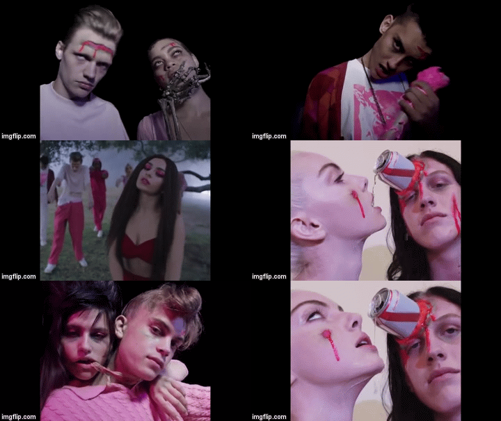
We conformed to this convention in our music video. All our editing is cut to the beat and we made sure to cut every shot just before the viewer is expecting a cut so there's never a moment where they're wondering where the next shot is. We still kept the chronological order of our editing clear, which is a convention for music videos in general and made sure our editing was 'invisible'.
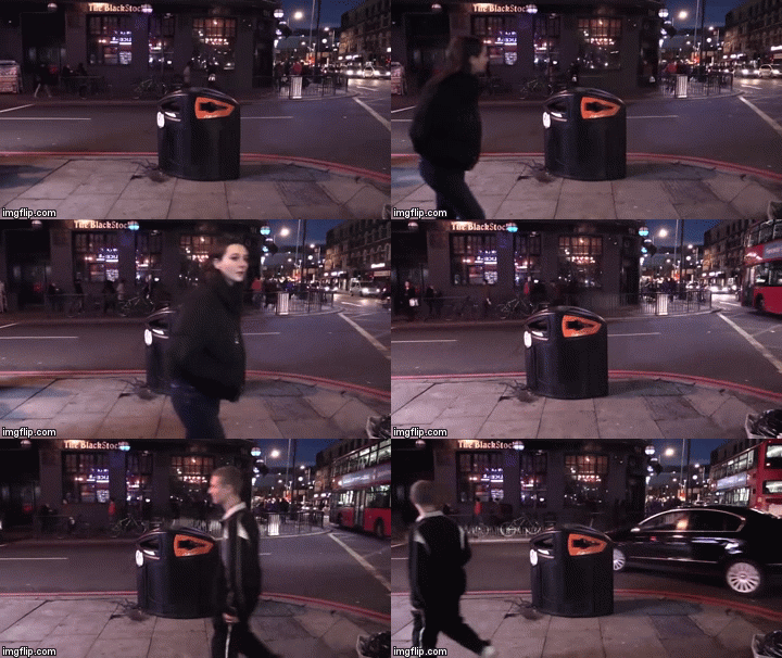
We also created a fragmented narrative through our disjointed editing that defied the continuity rule. this is common in electropop music videos. Jax is seen to walk one direction, then the screen shifts slightly and Mira is shown to walk the opposite direction but in the same path.
It is very common to have jump-cuts, fast-pace montage editing and cut to the beat footage in electropop music videos. This reflects the pace of the music, which is usually fast and up-beat, and also makes the video more artistic as it moves with the music.

We conformed to this convention in our music video. All our editing is cut to the beat and we made sure to cut every shot just before the viewer is expecting a cut so there's never a moment where they're wondering where the next shot is. We still kept the chronological order of our editing clear, which is a convention for music videos in general and made sure our editing was 'invisible'.

We also created a fragmented narrative through our disjointed editing that defied the continuity rule. this is common in electropop music videos. Jax is seen to walk one direction, then the screen shifts slightly and Mira is shown to walk the opposite direction but in the same path.

OUR WEBSITE
OUR ALBUM COVER
In conclusion, we made sure our media product challenged, used and developed the forms and conventions of real media products by researching existing products from the genre to see what the common trends were in our genre and use them accordingly.
Labels:
A2 Evaluation
Thursday, 26 January 2017
Evaluation Question 2: How effective is the combination of your main product and ancillary texts?
We successfully combined all 3 of our media products - album, website and music video - and their ancillary texts in a synergistic way in order to appeal to our TA and also gratify their needs and expectations for the brand.
What is the role of an album cover/music video/website?
The role of a music video is to promote a single and represent a particular genre showing how the artist fits into this category through, for example, costume and characteristics. The album is there to, usually, promote a tour/concert and collect revenue from the consumers. Whereas, website provides a central hub for the audience to find out all the information they need including links to every media product and it also creates a community for the primary TA (fans of the genre) where they can subscribe to news, comment on,share and view videos and images of the artist.
Therefore firstly, we wanted to make sure we had a solid artist identity for MiraJax which would attract the likes of our target audience. In order to get inspiration for ways we could achieve this, we read up on Richard Dyer's 'star theory' which I have outlined in detail in the Prezi below:
In order to get some inspiration for our own artist's star identity, we researched Rihanna who we thought had a similar persona as we wanted to achieve with Mira. I have created a slideshow presentation of a case study on Rihanna's star identity below:
So we constructed MiraJax through their characteristics as personable members of society that the audience can relate to but also be inspired by. Here are a few of the key factors we established in their star identity:
Down-to-earth, relatable and "not entirely fictional" -
Inspirational individuals who represent moral and empowering ideas -
SYNERGY:
I did some research on Disclosure, as they are a duo and I found out how they market their combination of media products in a synergised way. Below have summed up my research in a powerpoint:
What is the role of an album cover/music video/website?
The role of a music video is to promote a single and represent a particular genre showing how the artist fits into this category through, for example, costume and characteristics. The album is there to, usually, promote a tour/concert and collect revenue from the consumers. Whereas, website provides a central hub for the audience to find out all the information they need including links to every media product and it also creates a community for the primary TA (fans of the genre) where they can subscribe to news, comment on,share and view videos and images of the artist.
We needed to create a website, music video and album which incorporated connectivity, repetition and consistency in order to promote an artist duo, MiraJax, where its foundations are all working in harmony.
STAR IDENTITY:
Marketing Theory states that:
"When the audience is not interested in the person, product or service being promoted, they will not seek out any information about them."
In order to get some inspiration for our own artist's star identity, we researched Rihanna who we thought had a similar persona as we wanted to achieve with Mira. I have created a slideshow presentation of a case study on Rihanna's star identity below:
So we constructed MiraJax through their characteristics as personable members of society that the audience can relate to but also be inspired by. Here are a few of the key factors we established in their star identity:
Down-to-earth, relatable and "not entirely fictional" -
 |
| This is a screen-grab taken from our news page on our website |
- We want our audience to feel comfortable with MiraJax as they share things in common with them. We did this by presenting them as Londoners as well as youths.
- It is important that the audience sees them as real life people, not as simply an imaginable pair constructed by the music industry. We created a meet and greet, which is advertised on our website, for fans to meet their idols in the flesh. The meet-up is in London in order to appeal to the fans from London also, and to stick to the Londoner persona.
- We also achieved this by creating a BTS video on our narrative shoot day for audiences to watch and feel like they know MiraJax more after, essentially encouraging a relationship with them.
- The lyrics to their track Best Be Believing and the stories shown in their music video both promote happiness, colourful personalities, freedom and reaching your goals.
- This is relatable to the younger end of our primary TA of 16-24 year olds who are probably living at home or may experience restrictions in relationships which our video particularly focuses on.
 |
| A tweet from MirJax's official twitter page |
I did some research on Disclosure, as they are a duo and I found out how they market their combination of media products in a synergised way. Below have summed up my research in a powerpoint:
Below I have created a diagram including some examples of how we have made our album cover, music video and website synergised across various platforms.

As you can see, we have successfully achieved an overall marketing campaign for our 3 main products which is connected by its individual incorporated features.
THE WEBSITE:
Andrew Dubber suggests that a website is a place where people gather and connect with an artist and people aim to socialise, listen to music, talk about music and connect with other people about that music and more.
Tim O'Reilly suggests that a Web 2.0 website may allow users to interact and collaborate with each other in a social media dialogue.
Marketing theory also suggests that the website is, more often than not, at the centre of the marketing campaign, connecting all the products together via a central hub.
Our website provides an effective central hub which holds all the information our audience need and connects them to all our ancillary texts as well as allowing them to engage with the stars. As well as this, it is visually synergised with our other ancillary texts allowing them all to work in harmony in a stream-lined marketing process.
I have demonstrated this in a presentation below:
In conclusion, the combination of our main product and ancillary texts work in synergy and each individually create a successful brand/basis for our artists to grow from.
Labels:
A2 Evaluation
Wednesday, 25 January 2017
Evaluation Question 3: What have your learnt from your audience feedback?
Gathering audience feedback and analysing this feedback, I feel, was the most important part of the process. It made a key role in informing us on how we needed to adapt our products to make sure they were always tailored to our target audience's needs. We got feedback during the process of constructing our three media products and after we had finished creating our final products. Therefore, I am going to analyse both our TA and their feedback we received.
OUR TARGET AUDIENCE:
Primary audience:
FEEDBACK DURING THE CONSTRUCTION PROCESS:
We got audience feedback every step of the way during the construction of our music video, website and digipak. This way we could constantly improve certain aspects and realise what was going well and what was not going well.
Our music video:
We started off by getting feedback from our rough cut. The rough cut was vital for us, our audience and our teachers to get a general feel for the music video we were envisioning so they could all give constructive feedback on the good and bad things in our music video.
This is our rough cut:
We received verbal feedback from Flo; a 17 year-old female fan of Electropop. Her ideas can be heard in the video below:
<---BEFORE
AFTER-->
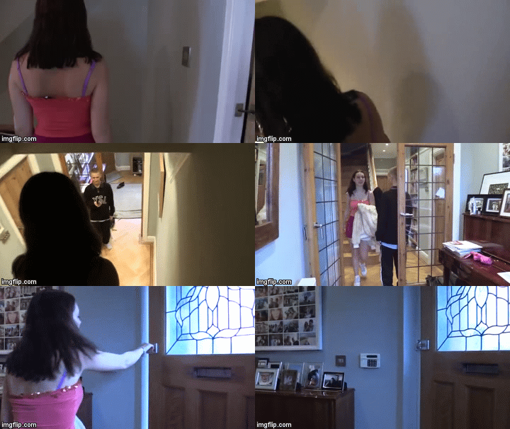
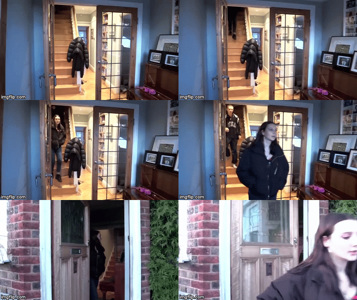
We took one long shot for our new and improved argument scene as oppose of trying to take several different angled shots which were hard to make continuous as we did previously. This would make it easier for the audience to follow.
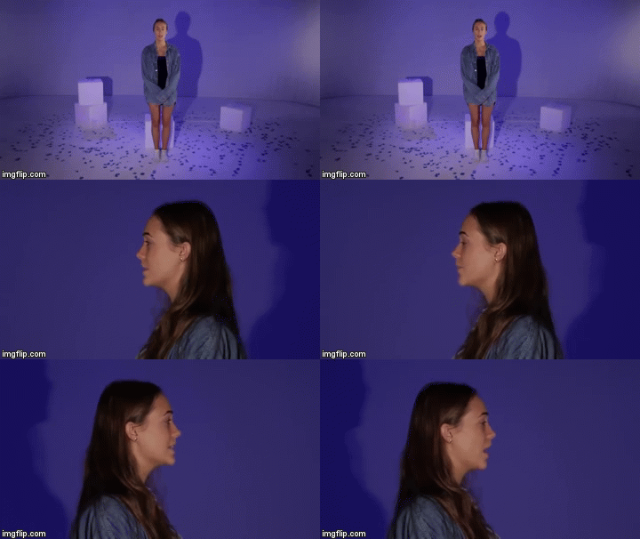
<--BEFORE
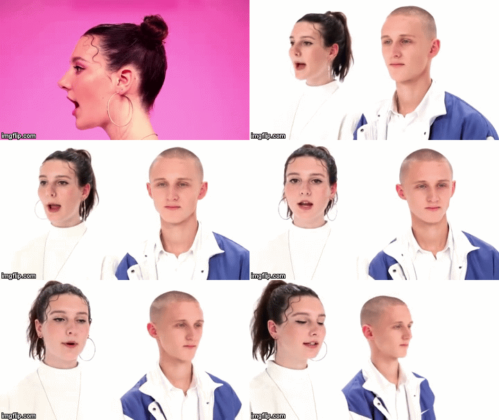
AFTER-->
Our website:
I got together a small focus group which was made up of a 17-year-old female who loves Electropop - Emma - and an 18-year-old male who loves UK music - Myles. I got them to go through our rough website stating what they liked and disliked along with any reoccurring themes they noticed which brought the website together, if any.
Here are some quotes of what they came up with:
EMMA - "OMG it looks so professional! I can see there are buttons everywhere for me to navigate through the website so thats a pro."
MYLES - "It's very colourful, I'm guessing that's a theme you were trying to present?"
EMMA - "You should have more ways for the audience to get involved with the artist cause at the moment it just a one-way thing"
MYLES - "Yeah, I agree. It's looking really good though, I'd definitely spend time scrolling through because of all the pictures and videos for me to watch"
They both agreed we needed more activities for the audience to take part in, involving them personally. We had thought of this but hadn't quite pinned down how we were going to achieve this. We had another brainstorm and came up with the idea of creating a competition for our audience. This draws on the 'personal relationships' uses and gratifications theory for the uses of our audience so it was vital we took them up on this feedback.
Our digipak:
Digipak final feedback:
From receiving this feedback, we know our audiences needs have been gratified in terms of the synergised imagery and understanding of the presentation of MiraJax's relationship as an artist duo and couple. Georgina also picked up on all the information available to the consumer which was very vast. Overall we are extremely happy with this feedback.
Website final feedback:
After finishing editing our website, we showed the final product to Max, a 17-year-old male who is a fan of electropop music. This is what he had to say:
We are happy with the feedback he gave us overall, which is good because at that point we were unable to change anything.
Music video final feedback:
We used Survey Monkey to construct a survey for audience members to fill out after we had finished creating our music video as this was the main product in our marketing campaign which had been given the most research, planning and construction time to. This way we can spot trends in the feedback we receive by asking of a bigger focus group. We wanted to see if the audience understood what was being presented to them and interpreted the texts in the way we had intended by calculating their uses and gratifications as an audience.
This is the link to our survey:
https://www.surveymonkey.co.uk/r/NMSM5GT
We asked the audience the following questions:
12 out of 18 of our survey responders stated that the video was"Electropop". Other answers included "alternative" and "Pop" which Electropop does come under but is not specifically that genre. I think the reason for the other answers could be because some people are not aware of Electropop as a genre - I was not aware of it before I started this project and thought our track came under pop and electric but did't know Electropop was necessarily a genre in itself. Taking that into account, I believe we were overall successful in representing our genre and the conventions of our genre successfully.
14 out of the 18 people who took our survey answered "yes" to wanting to find out more about MiraJax. I think this is a very positive outcome as, at the end of the day, not every music artist is to everyone's taste so we can expect that 4 people do not want to know any more about MiraJax (hopefully because thats just not their taste in music). Perhaps to bring this up to a 100% response of "yes" we could have added an unfinished ending to our music video, like a cliff hanger for example. So the video would end on a "to be continued..." type thing. However, we didn't do this but still had a very positive outcome to this question so we must have really engaged with the audience through our video and used editing techniques to keep them interested throughout.
'Having watched the video is there anything you would change?' got a wide range of responses, as expected due to the open-ended nature of the question. We were most excited for this feedback as a result.
50% of the people that responded to this question stated they would not change a thing. However 50% stated they would and here are some examples of what people said:
It is quite disappointing that a popular answer was to improve the quality of the narrative shots as they believed they were nowhere near as good quality as the studio shots. We always wanted to create a gritty, handheld filming effect in our narrative shots which we thought we successfully achieved. We wanted there to be a stark contrast between the pretty studio shots to the more realistic and relatable narrative shots. Unfortunately, half of our focus group did not understand the effect of this. I think this is partly due to the fact that some of the narrative shots, such as the tube station shots, are well lit and of an increased quality in comparison to the Alexandra park/Finsbury park shots which were lit by only a spotlight on top of the camera, purposely. I don't think we could have improved on this without taking huge studio lights with us on location (because we were filming at night) to keep the quality consistent, which was unrealistic for a school project unfortunately. However, I do understand why 50% of the research group had a problem with this.
Very common responses to our question of what they thought the story was that the music video was trying to portray were:
OUR TARGET AUDIENCE:
Primary audience:
- Fans of the Electropop genre
- Young adults/teens aged 16-24
- Boys and girls
Secondary audience:
- Older fans of the genre (25+)
- People who are interested/keen on the UK music scene
- Fans of similar genres e.g Pop
Tertiary audience:
- Friends/boyfriends/girlfriends/parents of fans of the genre who might come across MiraJax subsequently
- Music fans
USES AND GRATIFICATIONS:
In order to appeal to our target audience, we had to keep the uses and gratifications theory in mind at all times.
Our typical audience member would stream music through services such as Soundcloud and Spotify, however they would be likely to buy an album through iTunes of an artist they particularly liked.
Below, I have created a Prezi presentation demonstrating how we used the uses and gratifications theory throughout our project.
FEEDBACK DURING THE CONSTRUCTION PROCESS:
We got audience feedback every step of the way during the construction of our music video, website and digipak. This way we could constantly improve certain aspects and realise what was going well and what was not going well.
Our music video:
We started off by getting feedback from our rough cut. The rough cut was vital for us, our audience and our teachers to get a general feel for the music video we were envisioning so they could all give constructive feedback on the good and bad things in our music video.
This is our rough cut:
We asked her quite simple questions (what did you like/what didn't you like) as we knew our rough cut was not a true reflection of what we wanted to create; in terms of technicalities, performance and effect, it was very basic.
I also asked Georgia, a 18 year-old female who listens to Electropop sometimes what she thought we could improve on the video in a technical way as she has experience with working with cameras/photography. She said:
"the argument scene needs to be a lot more to the point, it's too boring at the moment"
There is clearly a trend in our feedback for the rough cut - shots need to be more snappy and "to the point" as well as improvement needs to be made in the argument scene.
As a result of this feedback we, firstly, completely changed our argument scene. We aimed to make it simpler and quicker so the audience did not get bored but also fully understood what was going on as this was the basis for the entire video.


<---BEFORE
AFTER-->
We took one long shot for our new and improved argument scene as oppose of trying to take several different angled shots which were hard to make continuous as we did previously. This would make it easier for the audience to follow.
As well as this we ended this argument scene on a second shot where the door slammed. This allowed a punchy flow into the next scene and marked the end of the argument; short but sweet.
We then altered the way we were previously filming by creating much more movement of the camera and movement and performance in the actual shots. Instead of having Mira standing static, singing to the camera, we made her act much more emotive, over-exaggerated and energetic. As well as this, we added dolly shots instead of just using wide-shots and close-ups.
We then altered the way we were previously filming by creating much more movement of the camera and movement and performance in the actual shots. Instead of having Mira standing static, singing to the camera, we made her act much more emotive, over-exaggerated and energetic. As well as this, we added dolly shots instead of just using wide-shots and close-ups.

<--BEFORE

AFTER-->
Our website:
I got together a small focus group which was made up of a 17-year-old female who loves Electropop - Emma - and an 18-year-old male who loves UK music - Myles. I got them to go through our rough website stating what they liked and disliked along with any reoccurring themes they noticed which brought the website together, if any.
Here are some quotes of what they came up with:
EMMA - "OMG it looks so professional! I can see there are buttons everywhere for me to navigate through the website so thats a pro."
MYLES - "It's very colourful, I'm guessing that's a theme you were trying to present?"
EMMA - "You should have more ways for the audience to get involved with the artist cause at the moment it just a one-way thing"
MYLES - "Yeah, I agree. It's looking really good though, I'd definitely spend time scrolling through because of all the pictures and videos for me to watch"
They both agreed we needed more activities for the audience to take part in, involving them personally. We had thought of this but hadn't quite pinned down how we were going to achieve this. We had another brainstorm and came up with the idea of creating a competition for our audience. This draws on the 'personal relationships' uses and gratifications theory for the uses of our audience so it was vital we took them up on this feedback.
 |
| our constructed competition can be found on our news page |
From our teacher feedback, they told us that the images in our image gallery were too small to view. We changed this and made them expandable when one clicks on the desired image.
Before you could expand them they looked like this:
Before you could expand them they looked like this:
After we altered it, they now look like this:
 |
| the viewer can also exit this expanded viewing by pressing the "X" button in the top right corner |
I created the flat plan which we gave to our audience in order to get feedback on what they thought of it. It was important we did this while still in the construction process so we allowed ourselves time to make changes and didn't waste any time making a real cover on photoshopped that was just going to be re-done.
Firstly, we asked Josh, a 17 year old male who is a fan of UK music, his initial reactions to our flat plan, good and bad.
He said:
"I like the use of the split screen but I think the front and back covers are a bit repetitive and the white background is boring for the whole album cover"
We already knew we would not be using the white background as a background as we would be using an image from our location shoot, which we made Josh aware of. We used this image on the front and back panels of our digipak, which I manipulated using photoshop.
As you can see from our final digipak (above), we also took Josh's advice and changed the back panel to be different from the front. This offered more variation and made it more interesting for the consumer.
FINAL FEEDBACK AFTER WE HAD COMPLETED ALL 3 OF OUR PRODUCTS:
 |
| our flat plan front and back panels |
He said:
"I like the use of the split screen but I think the front and back covers are a bit repetitive and the white background is boring for the whole album cover"
We already knew we would not be using the white background as a background as we would be using an image from our location shoot, which we made Josh aware of. We used this image on the front and back panels of our digipak, which I manipulated using photoshop.
 |
| the original photo |
 |
| after manipulation as our background |
FINAL FEEDBACK AFTER WE HAD COMPLETED ALL 3 OF OUR PRODUCTS:
Digipak final feedback:
When we had finished creating the final digipak. We got feedback from an 18-year-old female fan of Pop music. Here's what she had to say:
From receiving this feedback, we know our audiences needs have been gratified in terms of the synergised imagery and understanding of the presentation of MiraJax's relationship as an artist duo and couple. Georgina also picked up on all the information available to the consumer which was very vast. Overall we are extremely happy with this feedback.
Website final feedback:
After finishing editing our website, we showed the final product to Max, a 17-year-old male who is a fan of electropop music. This is what he had to say:
We are happy with the feedback he gave us overall, which is good because at that point we were unable to change anything.
Music video final feedback:
We used Survey Monkey to construct a survey for audience members to fill out after we had finished creating our music video as this was the main product in our marketing campaign which had been given the most research, planning and construction time to. This way we can spot trends in the feedback we receive by asking of a bigger focus group. We wanted to see if the audience understood what was being presented to them and interpreted the texts in the way we had intended by calculating their uses and gratifications as an audience.
This is the link to our survey:
https://www.surveymonkey.co.uk/r/NMSM5GT
We asked the audience the following questions:
- What is your age? MULTIPLE CHOICE
- What is your gender? MULTIPLE CHOICE
- What music genre(s) do you typically listen to? MULTIPLE CHOICE
- Having watched the music video, which genre do you think the song falls under?
- Having watched the music video, would you like to know more about MiraJax?
- Having watched the music video, is there anything you would change?
- What message do you think the music video is trying to portray?
- What would you rate the music video out of 10? MULTIPLE CHOICE
- How well do you think the music video works with the track? MULTIPLE CHOICE
- Did the music video make you want to buy the album? MULTIPLE CHOICE
100% of the 18 people that completed our survey were aged 16-24. This is perfect because the feedback will be specifically focused on the point of view of our primary audience members.
We had an almost 50:50 outcome with the genders of our audience members. But the results were skewed toward females. This is also very beneficial to us because the feedback they give will be both from a male and female perspective, the 2 genders of our primary audience group.
 |
| 8 males and 10 females responded |
 |
| some of our responses |
'Having watched the video is there anything you would change?' got a wide range of responses, as expected due to the open-ended nature of the question. We were most excited for this feedback as a result.
50% of the people that responded to this question stated they would not change a thing. However 50% stated they would and here are some examples of what people said:
 |
| a well-lit tube station shot example |
 |
| an Alexandra park shot example (bad quality) |
- young love
- the struggle of relationships
Unfortunately only one person caught on to the true meaning on the video - breaking free from all restrictions - but almost every survey member got the theme of relationships which was a sub-meaning to our video. I think this is because we chose to interpret the lyrics in a certain way - through the ups and downs of a relationship - so naturally, if one did not read into the lyrics, this is how they would interpret it in its base sense. We did, however, successfully present the dynamic between Mira and Jack and how the video follows an argument being solved so I am very happy with this. I know this because 100% of people voted "well" or "very well" as a response to the question: "How well do you think the music video works with the track?".
Overall...
The most popular score for our music video was 10 which is the ideal answer of course. I am pleased with our final audience feedback because we did manage to appeal to the majority of our audience.
Overall...
The most popular score for our music video was 10 which is the ideal answer of course. I am pleased with our final audience feedback because we did manage to appeal to the majority of our audience.
Labels:
A2 Evaluation
Thursday, 12 January 2017
Evaluation Question 4: How did you use new media technologies in the construction, research, planning and evaluation pages?
We were able to use a vast range of differing technologies in both pre and post-production as well as during the evaluation process. These included both new and old media technologies and we had the benefit of having these technologies right at our fingertips.
PRODUCTION:RESEARCH AND PLANNING:
I have created a mind map stating all the new and old technologies we used in the production: research and planning stage. Please press play or navigate using you mouse and the arrow buttons.
In conclusion, for the production stages in research and planning, we were able to use a vast amount of technologies, including old and new tech. I think the most impressive and vital tech we used (apart from the cameras) was Web 2.0. Web tools, social media, Whatsapp group chats, giphy, blogger etc. were extremely useful services which we could use on multiple platforms for free. Especially important was our phones, on which we used WhatsApp to discuss and plan ideas.
We used YouTube to create our Steal-o-matic for the R+P blog posts. I think this was a very key and interesting platform we used in the production stages so below I have drawn out the pros and cons of using YouTube in this way.
PRODUCTION AND POST PRODUCTION:
I then created a mind map describing all the technologies used in the production: construction stage:
Below is another mind-map I have created to demonstrate what technologies we used in post-production:
We used some old and new technologies in production and post production which I have layed out in detail in the padlet below:
Significance of Web 2.0 in creating our website in post-production:
After doing some reading on Andrew Dubber's "Toward a Sixth Media Age" I completely agree with his suggestion that Web 2.0 has brought a "new model of website" where "people can gather and connect with artists and with each other". I think our website is a prime example of how Web 2.0 has given us the opportunity to do exactly that, and for free!
EVALUATION:
Below is a mind map of the technologies used in my evaluation:
Below is a prezi I created explaining the pros and cons of the technologies I used in my evaluation. Please navigate through:
My learning curve:
At the beginning of this project, I was familiar with using a camera to film and shoot, editing using Premier Pro, using Photoshop to edit and create images, using Prezi,slideshare and giphy to create presentations on my blog. During the project, I learnt how to; use Wix, which I am now very confident on; I became much more confident on Photoshop and Premier Pro; I learnt how to us Padlet which I had never used before and I learnt, from scratch, how to light the studio, use the sound desk and film using the Cannon 5D MK II. The lighting and filming was very straight forward, however setting up lighting was a long process but was worth it when it made the set look great. Everything else was easy to use and easy to get the hang of quickly.
Conclusion:
To conclude, we have had the privilege of having both old and new technologies at our fingertips for the whole of this media project. The proliferation of Web 2.0 and the technologies it provided us meant that we, as prosumers, were able to to create whatever we wanted with a click of a mouse, while having fun at the same time.
Labels:
A2 Evaluation
Tuesday, 20 December 2016
Construction Post 6: Website post production
Editing our (almost) finished website:
As I mentioned previously, we used the website creator "Wix" to design and publish our website. None of us had used Wix before so we were excited to see what it offered.
We all found the website very slow so it was really challenging trying to make changes when the actions you were trying to complete were actually completing 10 seconds later than you wanted them to; we all found this highly frustrating. We also found that the "anchor pages" ( the blue line across the page shown below ) would move around every time we logged into Wix.
From all the existing music artist websites we have researched, we didn't find a single one that did not have at least 3 social media links on at least one of their website pages. For this reason, we stuck to this convention and included 3 social media links on the right had side of our website which appear no matter where you are on the website.
As well as this, we also created a visual summary of our Facebook page and our Instagram feed on one of our homepages. This way the audience's interest is captured by the visual presentation of our social media page, which will hopefully make them want to view more.
We had some complications with creating our news page. When adding the 'blog' feature which we would be using for our news, it had to be on a separate page. However, we wanted our whole website to be on one scrolling page so the only way we could get around this was to create a link on the scroll page to our 'news' page (the blog feature). This wasn't ideal but we didn't want to sacrifice our news page.
Target Audience Feedback:
As I mentioned previously, we used the website creator "Wix" to design and publish our website. None of us had used Wix before so we were excited to see what it offered.
We all found the website very slow so it was really challenging trying to make changes when the actions you were trying to complete were actually completing 10 seconds later than you wanted them to; we all found this highly frustrating. We also found that the "anchor pages" ( the blue line across the page shown below ) would move around every time we logged into Wix.
This wasted a bit of our time because we had to reposition the pages before editing the website every day. However, it was still very exciting and satisfying seeing the website fall into place.
We decided to have 3 pages on our homepage which would automatically flick through as the viewer opened the website.
Homepage page 1:
Homepage page 2:
Homepage page 3:
All of our homepages feature an image of both Mira and Jax and our logo. We felt this was key in order to establish our brand and after our TA said they'd expect lots of images of the artist/band on their website.
Originally, "Homepage 2" was our first homepage when the viewer entered the website. However, after speaking to some members of our TA, they informed us that, although the website looked incredibly professional, it was not clear that it was a music artist's website. They said it could have been a photographers blog or artist's blog. This is why we made "Homepage 1" our new first page, immediately establishing our brand, new album and artist duo.
We have 3 different ways the viewer is able to purchase through our site:
From all the existing music artist websites we have researched, we didn't find a single one that did not have at least 3 social media links on at least one of their website pages. For this reason, we stuck to this convention and included 3 social media links on the right had side of our website which appear no matter where you are on the website.
 |
| a visual presentation of the MiraJax Instagram feed |
 |
| social links |
As well as this, we also created a visual summary of our Facebook page and our Instagram feed on one of our homepages. This way the audience's interest is captured by the visual presentation of our social media page, which will hopefully make them want to view more.
We had some complications with creating our news page. When adding the 'blog' feature which we would be using for our news, it had to be on a separate page. However, we wanted our whole website to be on one scrolling page so the only way we could get around this was to create a link on the scroll page to our 'news' page (the blog feature). This wasn't ideal but we didn't want to sacrifice our news page.
The link above goes to this page:
We created a couple of competitions and meet and greets which allows the audience to engage with MiraJax. Our TA thought this was an "interesting feature" that they'd expect to see on a "professional" website...so we will definitely be keeping it!
We added an interactive way that viewers can play MiraJax's brand new single:
From talking to members of our target audience who said they'd expect lots of pictures and videos on an artist's website, we dedicated a whole page to "videos and photos".
Here we have, firstly, our music video for Best Be Believing, then we have a grid of images of Mira and Jax, followed by, finally, a BTS video from our music video shoot day.
When clicking on an individual image, the image is made bigger and the background fades like so:
Although our website is one scrolling page, the viewer can also navigate via the menu bar at the bottom of the page which provides a shortcut to any particular page.
Previously, we had not set up a payment account for the store on our website. With advice from our teachers, we added a payment method in order to increase professionalism. As well as this, we were advised to incorporate a shopping cart symbol somewhere which would be visible on every page, so the viewer can check their cart at any time. This is shown above next to our labelled page "shop".
Another feature we added so the audience could keep up-to-date with news on MiraJax was this subscription box:
This allows the audience to sign up to the MiraJax mailing list where they will be sent regular updates via email, so as never to lose track of anything to do with MiraJax!
 |
| me editing the website |
I spoke to Emma, a 17 year-old female friend, who gave us some very useful feedback on the finished website. Here is what she came up with:
Is the website easy to navigate around? Yes, I can see there are lots of buttons on the menu bar leading to different pages.
What do you like about the website? It looks very modern and I love the colour scheme! I like the fact the audience is given two ways to navigate around the website. It's good you have lots of pictures of Jack and Ella (Mira and Jax). The listening thing is cool! (the song playback feature)
Any improvements that could be made? I don't like how the song plays without you clicking 'play' as soon as you enter the website-this is distracting. Apart from that, I'm impressed!
From this feedback we did actually scrap the automatic playing of Best Be Believing on our website.
Labels:
A2 Construction
Subscribe to:
Comments (Atom)


